

After you put a lot of thought and effort into a sure-fire demo or amazing content your customers can’t resist, it can be a letdown when you don’t get the signups you expect. Given the ridiculous number of spam emails we all receive, it’s not surprising that web visitors are reluctant to sign up for sites they know little about. Here are 9 ways you can boost your conversions and increase SaaS demo signups with these surprisingly simple yet effective techniques.
Tips To Increase Software Demos
1. Keep It Simple
Make your software demo landing page clean and simple. Visitors know what they came for, so don’t make them jump through hoops to get it done.
Effective SaaS websites are simple and uncluttered with four basic components:
- Compelling page copy enticing people to sign up
- Social proof
- A form for them to fill in
- An unmistakable CTA
To keep it simple, eliminate any web design element that distracts from the Prime Objective.
2. Show Social Proof
Social proof is a psychological technique used to create FOMO (fear of missing out) and make people feel like they are making a good decision. It’s human nature to want reassurance, and they will be more inclined to sign up if others have already done so. Social proof comes in many forms. Social media testimonials, user reviews, case studies, number of users on your platform, and customer company logos are powerful.
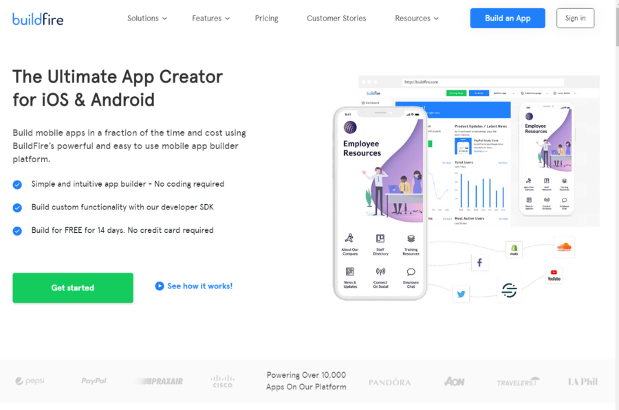
How well does social proof work? When Buildfire added the logos of companies they work with along with the number of apps on their platform, conversions shot up 46%.
3. Make Your Call to Action Unmistakable
Your call to action is the point. Make it stand out from the page. Choose a color and shape that complements the web design and colors on the page and still jumps out at the reader, even on a small screen. Pay attention to design trends and update your design elements when necessary. Then give it a prominent place above the fold.
4. Offer Two Calls to Action
No matter how brilliant your copy, some people keep scrolling. If they bypass one CTA, give them another shot with different wording. Change it up. And forget “Click here.” Use dynamic words that create a sense of urgency.
Great CTA choices include:
- Try For Free
- Get a Demo
- Get Started
- Sign Up Free
- Book Your Demo
- Reserve Your Spot
- Start My Free Trial
5. Simplify Your Sign-Up Form
Make it as easy as possible for visitors to sign up for your software demo by keeping the signup form simple. Use only one column, and don’t ask for too much information. The more information you require, the less likely visitors will complete the form.
Make it even easier by setting up social logins. Invite users to bypass entering information entirely by clicking “Login with Google” or “Login with Facebook.”
And while you’re simplifying, don’t ask for the same information twice. Prefill any information you already have, and carry it over to other pages if necessary.
6. Use Personalization
People respond to personalization. Not only do they enjoy personalization, they expect it.
- 80% of consumers are more willing to convert when brands offer a personal experience, and 90% said they find personalization appealing. – Epsilon
- 74% of customers feel frustrated when website content is not personalized. – instapage
- If you are going to personalize one digital channel, make it your website. 28% of consumers say a brand’s website is the most important channel for personalization, and nearly half (49%) rank it in their top two most important channels for personalization. – Segment
Delivering the personalization your web users expect is not difficult with Experiences. You don’t need to know a single line of code. It’s all done for you.
7. Offer a Guarantee
Consumers are always reluctant to give personal details before they get to know you. If you’re charging, then a money-back guarantee is appropriate. If not, a guarantee that you won’t sell or give away their email address.
8. Offer an Incentive
What is the benefit to signing up for a demo? If you offer an incentive, they will be more willing to provide personal info. Let people know what happens next. Define your value proposition to get your leads excited and provide an incentive to complete the form.
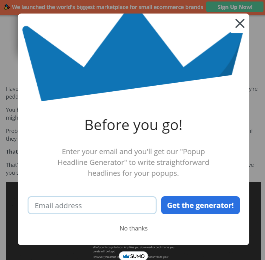
9. Use Exit Intent Pop Up
Exit intent popups are designed to stop the bounce. When visitors move their cursor towards the navigation bar to leave your page, a popup asks them if they really want to walk away from your great deal. It’s a last ditch attempt to remind them of what they’re missing out on if they click away. Think popups are annoying? You’re right, most people do. But they are also effective.
The top 10% highest-performing pop-ups averaged a 9.28% conversion rate. And, by conversion rate, we mean someone who saw a pop-up and took action. To put that into perspective, if you get even 150 visitors per day to your site you’d have 418 signups in a month. – Sumo
When I went to exit the Sumo popup statistics page, this popped up: Meta.
Software Homepage Examples
Here are some of the best SaaS website designs online. Each of these webpages showcases an SaaS product signup to great advantage. Use them as design inspiration for your landing page!
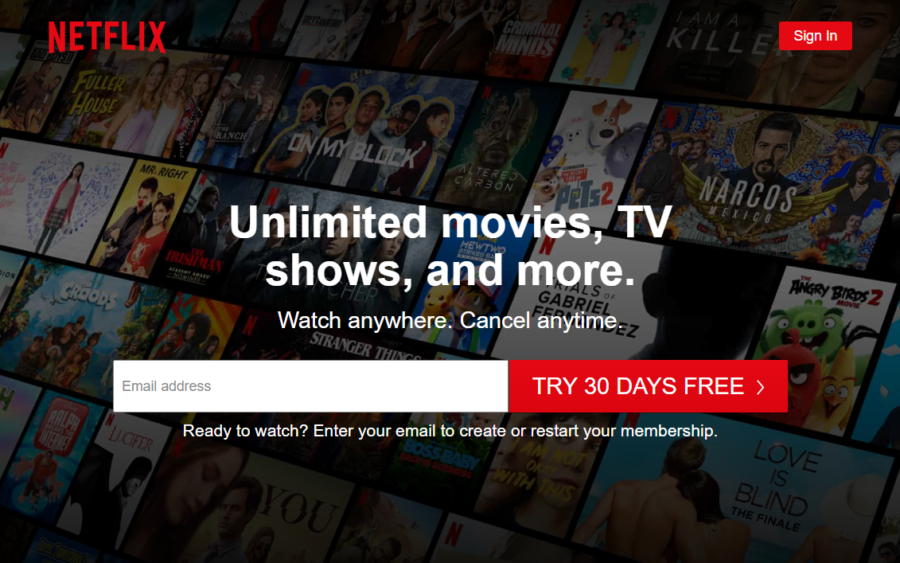
1. Netflix demonstrates a lot of best practices at once:
- The value of signing up is stated – and enticing
- You only need to enter your email address for access (there’s more later, but they already have your email address)
- The CTA is above the fold, isolated, and unmistakable
- The CTA explains what you’re getting when you sign up
- Bright CTA color that complements their brand color and webpage design
Note the limited use of color in this great design, just cream and green. And yet the CTA button jumps right off the page. Shopify uses white space to great advantage, with limited but compelling copy. The single impact statement says it all.
Salesforce gives you two CTA choices, Start my free trial and Watch demos. Their web design has tremendous visual appeal and simple styling, but it’s packed with information. In a glance, you can learn what they offer, how much it costs, and even see a screenshot of their user interface. They put their product features and value proposition on full display.
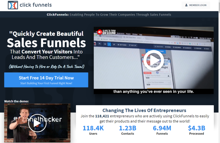
Social proof is front and center on ClickFunnels home page. Their value proposition is clearly stated, their CTA button is bright and clear, and they add videos for extra impact.
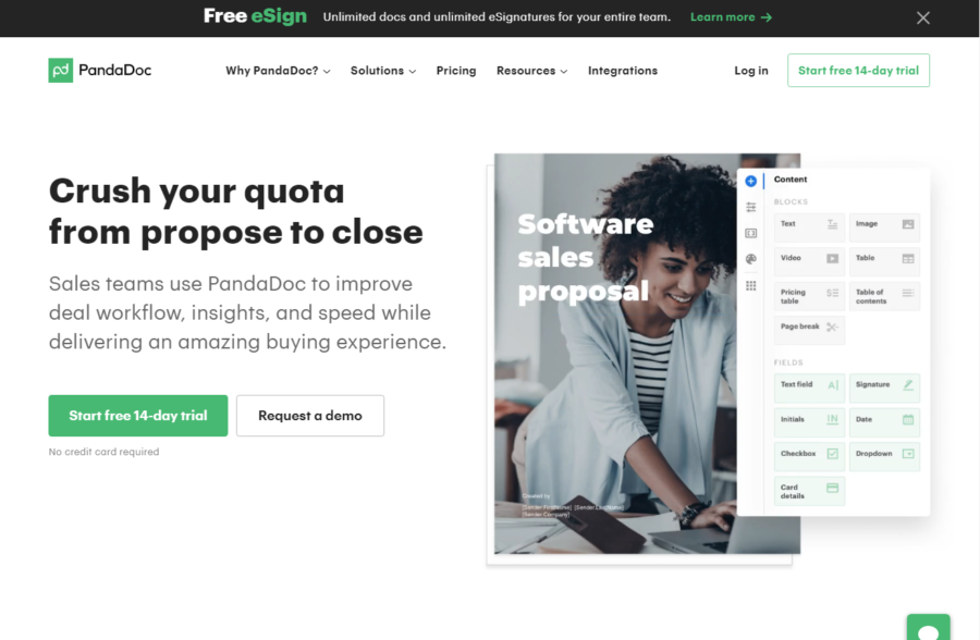
5. PandaDoc
With its clean ux design, PandaDoc’s landing page features a simple demo video that dynamically demonstrates its ease of use, a powerful selling point.
6. ProfitWell
The ProfitWell page design really pulls it all together. Nothing about the page is confusing. They make great use of white space, have limited, compelling copy telling you exactly what to expect, offer two options – Get Started and Chat with the Team, and display social proof to help you make a decision. The colors are limited and complementary, and the signup button is unmistakable. Check out how they get more signups by personalizing their CTAs.
in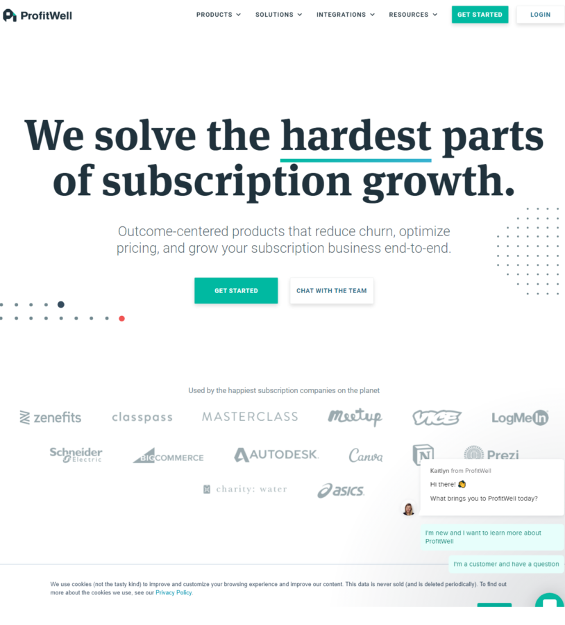
If you’re ready to create a killer demo signup page to boost your SaaS Sales, get your design inspiration from these amazing ux designs.


