Some landing page examples should serve as warnings. Earlier today I was searching for a better way to find deals on plane tickets. I clicked onto one of the first sites that popped up on Google — it seemed promising…
But the homepage was a terrible color, and the content was jumpy and glitchy, and blocks of text covered my screen. I didn’t immediately find any helpful information, so I clicked back, in less than two seconds, and I moved on to the next page.
We all do this every day: internet searchers are ruthless and unforgiving.
We expect information quickly, easily, and beautifully to top it off.
And we make that judgment in a fleeting moment.
A high converting landing page will make or break your campaign.
Landing pages are the perfect opportunity to give your audience what they want on a golden platter, but if you present the wrong gift, or do it the wrong way, you’ve thrown away your shot. As an entrepreneur, you know each customer is way too valuable to be this disposable.
But you’re in luck: we collected these landing page examples so you don’t have to.
You’ve got to instantly establish your authority and present a really solid call to action in an impactful and convincing manner to reel in your leads. The people visiting your page should need what you have to offer.
At Proof, we’re all about helping people get more conversions with less work. We believe good business should be efficient, honest and beneficial for both parties. We’ve seen a handful of top-tier entrepreneurs swing for the fences and attain incredible conversion rates with this attitude.
We’re really proud of them, and we’re thrilled to have been part of their journey to success. Our research shows that only 1% of websites in the world get conversion rates above 60%.

Today, we’re excited to reveal the first round of members of Conversion Club, an elite group for the top 1% of converting pages on earth. These members all have conversion rates over 60%, have acquired over 100 conversions, and use Proof on their site.
We’re going to take a look at what they’re doing with these landing page examples and discover some of the keys to their success.
18 Landing Page Examples with Conversion Rates That Blew Us Away!
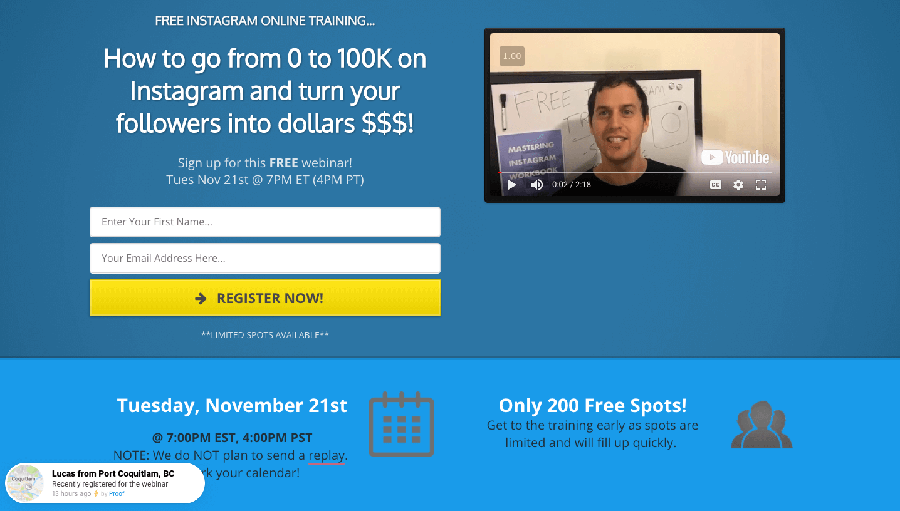
Brendan Burns from Mastering Instagram: CR 61.88%

Brendan uses his site to offer free online training on building an Instagram following . He teaches businesses and social influencers how to grow and monetize their Instagram accounts. The landing page example pictured above has a 61.88% opt-in rate. His site features:
- minimal background, bright accent colors
- scarcity incentive
- exit popup
- prominent lead capture button
- emphasis on profit/gain
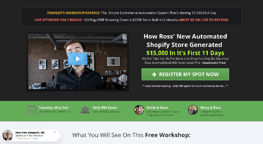
Devin Zander from SMAR7 Apps: CR 92.46%

Devin created BringTheZander to develop Shopify apps that help users increase their store’s sales. He has an astonishing conversion rate of 92.46% and his webinar opt-ins are in the thousands. His site features:
- minimal background, bright accent colors
- scarcity incentive
- exit popup
- prominent lead capture button
- emphasis on profit/gain
Franck Rocca from Propulser: CR 60.5%

Franck specializes in Facebook ads to help his audience of entrepreneurs learn more about online commerce. His class reached opt-in conversion rates of 60.5% for over 1,300 attendees. His site features:
- minimal background, bright accent colors
- authenticity by showing a photo of a human
- special offer on the top right corner
Régis Moscardini from Auxois Nature: CR 88.72%

Regis developed a wildlife photography guide for other photographers. Last month, his guide was downloaded several hundred times and his landing page attracted an 88.72% opt-in rate. His page features:
- minimal background, bright accent colors
- prominent lead capture button
- emphasis on profit/gain
- testimonial quotes
Nate Morse from RVing Planet: CR 73.31%

Nate helps people in the market for a new RV go through the complete journey from research to purchase of a new mobile home. With this free guide for shoppers, he’s built up a conversion rate of 73.31%. His page features:
- minimal background, bright accent colors
- prominent lead capture button
- emphasis on profit/gain
- testimonial quotes
Kim Snider from Reverse Your Funnel: CR 60.03%

Kim conducts a webinar for small businesses who are interested in learning minimum viable marketing. Her conversion rate of 60.03% from Facebook ads is far beyond the industry standard conversion rate of 9.21%. Her page features:
- scarcity incentive
- exit popup
- prominent lead capture button
- emphasis on profit/gain
- testimonial quotes
Travis Stephenson from Wealthery: CR 68.35%

Travis launched Wealthery to teach entrepreneurs how to use Chatbots and other SaaS tools in his live webinars. His most recent bootcamp registration attracted an opt-in rate of 68.35%. His page features:
- scarcity incentive
- prominent lead capture button
- emphasis on profit/gain
Brad May from Tackle Trading: CR 85.43%

Brad is a coach at Tackle Trading, where he educates people on the best way to trade and invest their own money. One of his most recent webinar registration campaigns had a conversion rate of 85.43%. His site features:
- emphasis on profit/gain
Aarin Chung from Honey Bar Media: CR 64.10%
Aarin offers real estate marketing products, services, and websites to real estate agents. Her free online marketing plan download has a 64.10% conversion rate. Her site features:
- minimal background, bright accent colors
- exit popup
- prominent lead capture button
- emphasis on profit/gain
- testimonial quotes
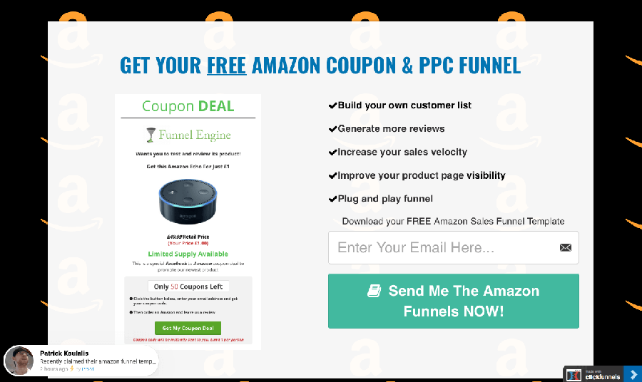
Richard Patey from Funnel Engine: CR 63%

Richard offers an introductory landing page for entrepreneurs who are learning to set up their first sales funnel. The affiliate marketing site promotes sites such as Clickfunnels and Samcart, with a successful 63% conversion rate. His page features:
- scarcity incentive
- prominent lead capture button
- emphasis on profit/gain
Tim Han from Success Insider: CR 77.86%

Tim runs Success Insider, a personal development course for entrepreneurs who are seeking accelerated growth, individual training sessions, and exclusive membership. The opt-in rate of 77.86% last week brought over 1,000 applications. His page features:
- prominent lead capture button
- emphasis on profit/gain
Rubén Gallardo Lobato from Aprendamos Marketing: CR 67.54%

Rubén runs Aprendamos Marketing, a digital marketing firm focused on educating business owners and entrepreneurs on the most efficient ways to improve their outreach. He has successfully attracted thousands of registrants with a sign-up rate of 67.54%. His page features:
- minimal background, bright accent colors
- prominent lead capture button
- emphasis on profit/gain
Matt Gartner, E-Commerce Consultant: CR 75.45%

Matt’s 5 Day Clickfunnels E-Commerce Challenge uses a breakthrough strategy with Clickfunnels to help entrepreneurs and business owners interested in e-commerce and dropshipping how to leverage their audience for more conversions. He has earned a 75.45% opt-in rate for this introductory challenge. His site features:
- minimal background, bright accent colors
- prominent lead capture button
- emphasis on profit/gain
Stephen Somers from Marketplace Superheroes: CR 66.45%

Stephen helps entrepreneurs learn how to profit from Amazon’s business model and leads them through the process of beginning their own brand by “scratch selling” products. His webinar training attracted a 66.45% registration for the live session, and hundreds of people attended. His site features:
- scarcity incentive
- exit popup
- prominent lead capture button
- emphasis on profit/gain
- testimonial quotes
Scott Baptie from Food for Fitness: CR 62.69%

Scott runs Food For Fitness to provide simple, enjoyable, and realistic nutrition and fitness advice. His recipe eBook freebie has accumulated thousands of opt-ins with a conversion rate of 62.69%. His site features:
- minimal background, bright accent colors
- prominent lead capture button
- emphasis on profit/gain
- testimonial quotes
Rob Warner from Invisible PPC: CR 80.89%

John helps growing pay-per-click agencies learn how to get new leads. The 3-part masterclass webinar offers 23 lead generation strategies, which has brought hundreds of attendees with an 80.89% conversion rate. His page features:
- scarcity incentive
- prominent lead capture button
- emphasis on profit/gain
- testimonial quote
Aiman Nizam from Riezthelicious: CR 65.78%

Aiman gives online pastry baking tips and insights through online courses on Riezthelicious. The email opt-in form offering a brownie recipe and coaching has resulted in a 65.78% conversion rate. This site features:
- prominent lead capture button
- testimonial quote
Reelika Schulte from Design Dream Lifestyle: CR 75.75%

Reelika is a coach for other coaches, focusing on training women in developing their own packages, creating passive income products, and setting high converting sales funnels to launch businesses and achieve minimal-effort success. Her free downloadable workbook has a conversion rate of 75.75%. Her site features:
- minimal background, bright accent colors
- prominent lead capture button
- emphasis on profit/gain
What do these landing pages have in common?
At a glance, these high performing, high converting landing page examples are pretty different from one another. They’re all offering different things across several different sectors to dozens of different audiences.
But when we started taking notes, we realized they’re doing a lot of the same things. Since a few of these common practices probably lead to these entrepreneur’s crazy-high conversion rates, there’s got to be value in what they’re doing. Here’s a breakdown:
56% of the top-performing landing pages that convert used bright accent colors on a minimal background.
Blurgroup, an enterprise marketing service, says warm, bright colors are visually engaging. They appear to enlarge objects and make them seem closer- which is a great tactic for a subtle marketing improvement.
Using color to highlight your offers and call to action will attract your audience to the best content, while a minimal background keeps the space clean and approachable. As da Vinci said, “Simplicity is the ultimate sophistication.”
39% of the best landing page examples advertised scarcity.
Limiting supply to increase demand is a basic principle of economics. Even if the demand for what you’re selling remains constant, scarcity will increase your price. Diamonds are considered a rare supply with high demand and increasing price. We all believe diamonds are incredibly rare.
But this is all rooted in a marketing ploy by De Beers and other large diamond companies: they positioned themselves as a top-level supplier in their market, tailored their messages to the proper elite audiences, then watched the money roll in.
Diamond producers have vaults of diamonds the world has never seen because it’s all about limiting supply: as long as we believe there’s a shortage, we’ll search for an opportunity to get what we want and feel incredibly satisfied when we find it. That’s a fantastic position to put yourself in if you’re looking for more conversions.

45% of these great landing page examples provided testimonial quotes.
Testimonials are the original social proof. People need to see they’re not alone. They feel reassurance in learning from others’ experiences. A simple quote or two on a page (bonus points if they’re from a well-recognized company) guides prospective clients toward trusting you.
If you’re looking for a babysitter, you’d probably rather hire your friend’s favorite, trusted babysitter before you dive into the Craigslist ads. Here’s a great guide to testimonials with tips for using them legally and effectively.
89% of the best landing pages prominently featured their lead capture button.
Highly effective lead captures are critical for a successful campaign, but we’re frequently surprised by how poorly some landing page examples integrate theirs in their content.
Nearly all of these high converting landing page examples use clear, concise messaging and design to attract their audience to this section. And it clearly worked: prominent lead capture buttons lead to astronomical conversion rates.
28% of high-converting landing pages used an exit intent popup.
You’ve probably seen several pages use an exit intent popup before: as soon as you scroll to close the tab, or click back from the page you’re on, the page springs to life with a “Hey, wait!!” message. There’s plenty of reasons a user may leave your page.
Exit popups give you the opportunity to make one final attempt at attracting whatever portion of your audience needs a boost in conversions. Maybe price point is your biggest detractor: you can offer a discount or an added value offer. Whatever you need, exit popups give you one last chance to attract a few more conversions.

89% of the top landing page examples put an emphasis on profit or gain for the customer.
It’s a tried-and-true method: “FREE” is a great way to sell. Valuable generosity makes customers feel prioritized and accommodated. While free content won’t attract a highly-targeted audience, it will attract a wide audience that contains your target, and a small sample of what’s to come will always help attract the paying customers.
And of course, 100% of the best converting landing page examples used this one critical method…
18/18 of the top converting landing page examples displayed above all used Proof to optimize conversions throughout their campaign. We’re really proud of what Proof is doing to grow amazing companies like the ones we’ve shown above. Each of these landing pages that convert yielded a conversion rate of over 60%.

This is your invitation to join us and boost your conversion rate starting today: join our email list below, and you’ll get more amazing conversions tips, and an opportunity to try Proof free for two weeks. And we’d love to hear what you think after you’ve tracked your results.
Do you belong on this page? Join our brand new Conversions Club if your campaign has a conversion rate of over 60%.
And curious about Proof? Why not give it a try…
What other methods do you use to optimize your landing page and reach sky-high conversion rates? Tell us what you think in the comments.
