

Rebrands can suck. There are lots of reasons not to change your company’s look and feel. They’re expensive (pause for a moment and imagine finding and replacing every instance of your current logo). Secondly, it takes focus away from other significant activities like finding product-market fit.
Many entrepreneurs, rightfully, don’t have the time or budget to successfully brand their company at early phases (take Airbnb or Foursquare’s pitch decks, for example). Finally, if anyone is paying attention to your rebrand (many don’t), it will evoke reactions of the bush-league, Twittersphere variety. Haters gonna hate. So why keep a rebrand in-house versus outsourcing it to an agency?
That sounds green-lit to me.
A culture shift, not a redesign.
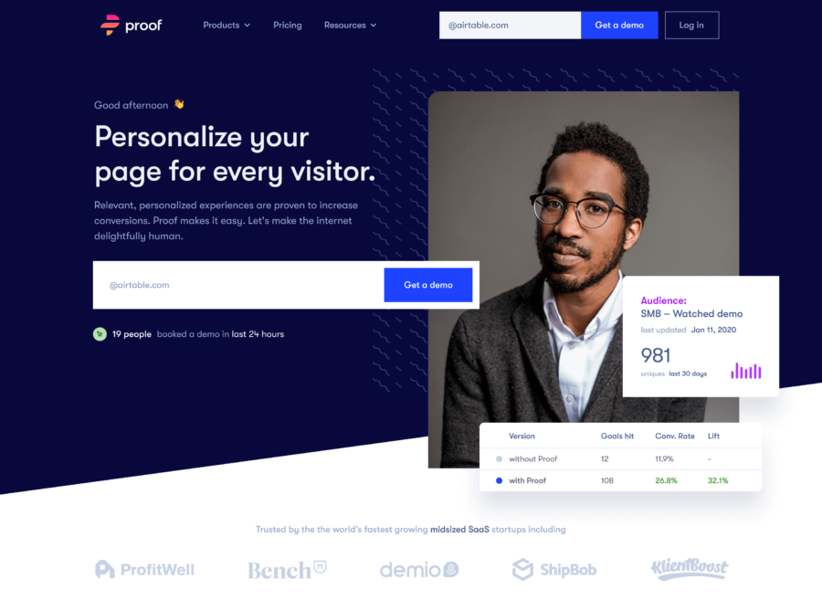
The rebrand was much more than a new logo. It was about embracing and evolving the company culture. It was a shift in mindset. By the end of 2019, we had new teammates, core values, and a second, better product. We weren’t a notifications company anymore, and, for a variety of reasons, our old brand impeded our efforts to sell Proof to the right people. We wanted Proof to appeal to all marketers, so we produced a more balanced and inclusive aesthetic.
With our flagship product, Experiences, we had a new story to tell, and we couldn’t tie our message to an outmoded toolkit. We needed a fresh set of assets to grow alongside our aspirations for the future. At three years into the life of our company, we hit the reset button.
“As we extend to adding new products, we needed to reposition ourselves a bit to encompass where we are going as a company.”
– Dave Rogenmoser, CEO
This is Proof
This new direction is emblematic of our new company culture and ties directly to our mission statement “Make the internet delightfully human.” It resonates with our current and future customers, is more premium in feel, and typifies something a B2B SaaS company would be willing to pay a good amount of money for.
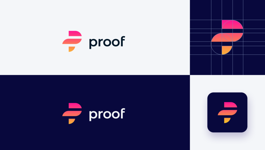
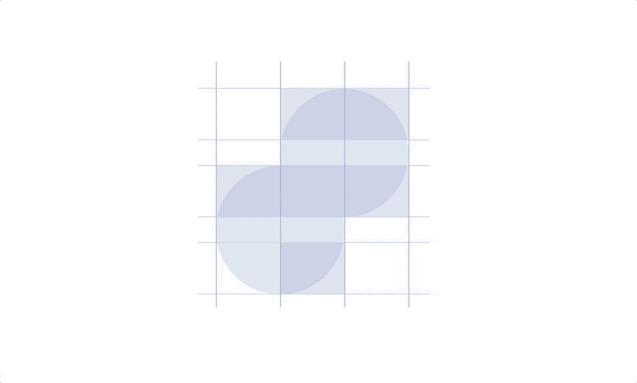
- Heavy use of geometry reinforces our first principle, “Nail the Basics.” It alludes to pieces of call-to-action buttons, the most critical interactive element on a web page. At its core, Experiences drives conversions through personalized content, and nothing is more effectual than a well-crafted button.
Figma + Webflow = ❤️
- The gradient reinforces our second principle, “Integrated.” Each campaign flows to — and impacts — the next. The vision for Proof is to enable marketers to collaborate broadly with teams (designers, writers, developers) in fresh ways. We want to build emotional connections not only between Proof and our customers — but between marketers and their customers.
- The middle section is extended to create a cape. This points to our third principle, “Empowering.” We help marketers do things with their websites that weren’t possible before. We strive to make products that multiply your efforts and make you a hero. Proof gives you superpowers.
Being co-Located mattered
Having access to the founders was crucial throughout the development of the brand. I can’t imagine front-loading the discovery process with anecdotes and interviews.
While that served me well in forming an initial direction, absorbing the rituals, work habits, and cadences — things that weren’t said in kickoff — was the key to developing the right mark. Only being present, day in day out, captured this. We iterated quickly, and our initial brand exercise was an excellent example.
In-house didn’t mean navel-gazing
While I owned the execution, I had the support of numerous people that pushed the thinking and improved the direction. I leaned on the broader design community for feedback. Former employees, peers, Slack communities, and tools like usabilityhub.com informed the final work. It’s incredible the amount of helpful feedback you can get for free.
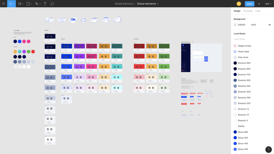
Kept me in lockstep with Product
As the brand progressed, we were able to update the design system as we went. Having brand and product design under one roof helped dictate requirements and bring a cohesive experience across both properties.
Final Thoughts
While I love Webflow — it’s unlocked a lot of possibilities to create web assets without nagging engineers — it has inherent limitations and can’t replace a well-coded front-end. Some trickier interactions like sliders and form validations couldn’t be built. Out-of-the-box solutions on libraries like Flowbase are limited and sparsely populated.
Design truly is a competitive advantage, and I’m grateful for the support from the founding team. I expect we’ll outgrow this framework in a few years, but this declaration (rebrand) sets Proof up for success in 2020 and the years to come. Oh, yeah. If you want to join Proof, we’re hiring.


