

Imagine spending lots of money on driving traffic to your website… only to find that the traffic doesn’t convert.
It’s a nightmare situation, but for many of us, it’s the grim reality. We chase traffic but do nothing with it. No leads, no sales — no profits.
In its most simple form, conversion rate tells you how healthy your website is at a point in time. A healthy, well-performing website will be music to the ears of your site visitors and your conversions will be up. For this to happen, you need to implement the right methodology, and you need to do your research.
Conversion optimization research does take time and effort, but a strong strategy is the best route to success. By carrying out thorough research, you’re also in a position to optimize your whole website, which will yield fruits as the months and years pass.
Ready to boost your conversion research and bag yourself more leads? Let’s take a look at the ultimate guide to conversion rate optimization research.
Carry Out A/B Tests On Your Landing Pages
A key part of conversion research is performing A/B tests on your landing pages.
If your conversion rate is down, it likely is due to your landing page.
But which aspect of your landing page? Your CTA might be the bomb, but your body copy might be problematic. Or perhaps both those elements are fantastic, but it’s your images that are letting the team down.
The easiest way to figure out what’s working and what isn’t working on your landing page is to carry out A/B tests (also called split tests). This is when you make one single change to your landing page and run two different versions to groups of traffic.
For example, let’s say I decide to test how effective my CTA is at converting my visitors. Group A gets to see one version, and Group B gets to see another. Whichever version performs the best is the one I will go with from now on (if it’s statistically significant).
I can also do this with my headlines, images, copy, and the other variable on-page elements. However, I only change one thing each time.
Why? Because if I make multiple changes at the same time I don’t know what single driver is affecting my conversion rate.
A/B tests on your landing page can be powerful. President Barack Obama split-tested his website during his 2008 election campaign. In fact, they split-tested 24 different variations of the same page! It took some time, but eventually, he found a conversion rate winner that he ran with for the rest of the campaign.
Discover Your Customer Value Proposition
Why should customers buy from you? If you can’t answer this question as simply as possible, it’s most likely that you haven’t yet figured out your customer value proposition (CVP).
A crucial part of conversion rate optimization research is fine-tuning your CVP so that customers know what your values are, and whether they’re the same as their own.
Moreover, a clear CVP also helps to establish trust. Remember, customers won’t buy from you until they trust you.
So what makes a good customer value proposition?
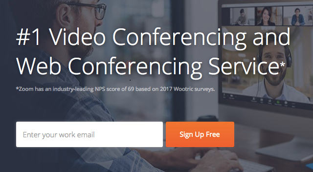
It helps to make it immediately clear what you’re offering and why someone should choose you over a rival. Take a look at Zoom’s landing page and CVP below. Their service is one of the top-rated video conferencing and web conference tools, which instantly boosts the credibility of their page. This type of social proof is super powerful and builds trust among customers who have never heard of the brand before. They back up their claim with NPS data and give a first-time visitor a powerful reason to trust their service.
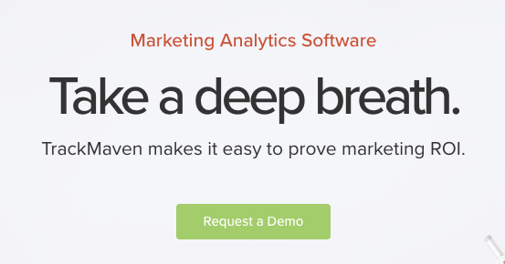
TrackMaven, on the other hand, goes down a different route. Instead of using social proof, they tap into a huge pain point for their customers — ROI. All while making it look easy.
To figure out your CVP, you need to understand your target audience and what matters the most to them. Use your analytics tools or carry out customer research (surveys, feedback, etc.) to find out their most significant pain points. Then, create a headline, imagery, and messaging on your landing page that acts as a sort of “dog whistle” that speaks to your ideal customers.
Then, use this checklist as you create your CVR:
- Make it concise
- Make sure it defines exactly what you do
- Briefly explain the pain point your product addresses
- Make sure your CVP is prominent on your page
Simplify Your Copy
Your copy is what keeps a prospect on the page, leading them on a journey from the beginning to the end. To sustain interest, it needs to be compelling, direct, while remaining natural and conversational.
To simplify your copy, let’s take a look at what copy needs to do in four stages:
- It needs to understand the needs/pain points of a customer
- It needs to show the customer a solution
- It needs to answer any objections
- It needs to convert the visitor
To help you cover those four stages well enough to keep a customer on the page until they convert, here are some actionable tips:
Create a Customer Persona
Create a customer persona and then, as you write your copy, pretend that you are writing directly to a customer who’s sitting in the same room as you. This will make your copy more natural, and it will ensure that you address a real person’s pain points.
It will also help you to…
Address Objections
Customers will always have objections. They might be worried that something is too expensive, too difficult to use, or time-intensive to implement.
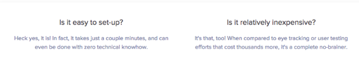
Take a look at how Crazy Egg fended off objections on the page below:
Use The Appropriate Language
Should your copy be funny, professional, abrasive? Understanding your customer persona will help you speak your customer’s language.
This is super important because using the wrong language will instantly break rapport. Once that is broken, you’ll lose conversions.
Address Benefits
Bad, awkward copy is that which addresses features and not benefits. As the great copywriter David Ogilvy pointed out, “Consumers do not buy products. They buy product benefits.”
Right now, a customer wants to know what your product is going to do for them.
To understand the answer to this better, again cultivate some feedback on your customers. What pain points do they want to address? Once you understand this, you can write better copy that demonstrates the benefits of using your product.
Use Headers, Short Sentences, and Bullet Points
To keep readers on the page until they convert, your copy needs to be as simple, natural and direct as possible. It also needs to be readable and well-presented. To that end, use headers, keep your sentences and paragraphs short and use bullet points to emphasize key issues. Like we are doing in this article.
Experiment With Creating Urgency
If you have a lot of similar products, it can be tough for a customer to decide which one to pick — they can have decision paralysis.
Worse still, they might fall prey to the dreaded paradox of choice: when we’re given too many options, we end up picking none of them. However, if you have a lot of similar products, to improve conversion rates, you can experiment with creating urgency.
How many times have you seen a store tell you that there’s “only a few left in stock!”? This kind of message compels you to take action so that you don’t miss out on a limited-time offer.
If customers are hesitating over a purchase decision, all it can take is for you to create a bit of urgency for them to convert.
Here are a few examples:
- “50% off your next purchase — but only valid today!”
- “Only 2 items left in stock!”
- “Limited time only!”
- “This deal will end tomorrow!”
When creating urgency, consider experimenting with time (final day to get this offer) and supply (just 2 products left). But remember, always be authentic.
Add a Video
Video marketing continues to be popular for numerous reasons. One of the prime reasons for placing a video on your landing page is that can boost conversions by as much as 80%.
This is because video helps to build trust among your consumers, and it gives you more credibility at the same time. Moreover, a product video or a business explainer video is helpful and educates customers so that they’re able to make a better, more informed purchase decision.
Studies have indeed shown that 74% of users bought a product immediately after watching an explainer video.
When you create your video, there are a few things to be mindful of:
1) Make your audience feel something: The Dollar Shave Club tapped into a core emotion among their audience when they made their viral explainer video. They made people laugh, and it helped to turn the company into a billion dollar acquisition.
2) Keep it short and sweet: Explainer videos shouldn’t last longer than 2 minutes. They need to be brief, informative, and they need to remind the viewer of their pain points before showing them how your company is going to solve them.
3) Include a compelling CTA: At the end of the video, add a compelling CTA that points the viewer in the direction you want them to take. It might seem unnecessary to hold a customer’s hand, but online, it’s incredibly important to actively guide your audience
Experiment with where you place your video, and how much your conversions increase when you add it to your landing page.
Test Your Call to Action
According to one source, there are 71 things we should A/B test in a bid to optimize conversions. 71 tests is a lot, of course, and few businesses have the time for that type of commitment.
However, what all businesses need to make the time for is testing their CTA. According to Crazy Egg, if you test your CTA, you can improve conversions by 13%.
Here are a few things you can test on your pages:
Button Size
Experiment with both the size and color of your button. Which converts best? The color of your button needs to contrast with the background colors — but other than that, you’ve got lots of options to test.
Text
Experiment with what text works best for your audience. Copy such as “Download Now” might work best for you, or you might find that using first person language — such as “Give Me My Free eBook!” — works better as it creates a sense of ownership for your visitors.
Whatever you write, your text needs to be simple, direct, and it gives your prospects just one thing to do.
Special Effects
Some CTAs have drop shadows, others have rounded corners. Some have gradients, others have arrows. Experiment with special effects to see what works and more importantly, what doesn’t.
Position
It’s common practice to place a CTA at the bottom of the content. However, you might find that positioning your CTA above the fold works better, or you might even decide to experiment with a scrollable CTA that follows the site visitor around as they move through a page.
Add Testimonials
Testimonials give your brand more credibility, and they’re especially important to use if no one has heard of your company. If customers can see that others are buying from you and are satisfied with their purchases, it can be just the nudge in the right direction that they needed.
For increased conversions, where you place your testimonials is crucial. Because your landing page typically gets the most clicks on your site, it’s always a good idea to place your testimonials here, front and center. Seeing positive feedback literally seconds after arriving on your website can encourage users to keep browsing.
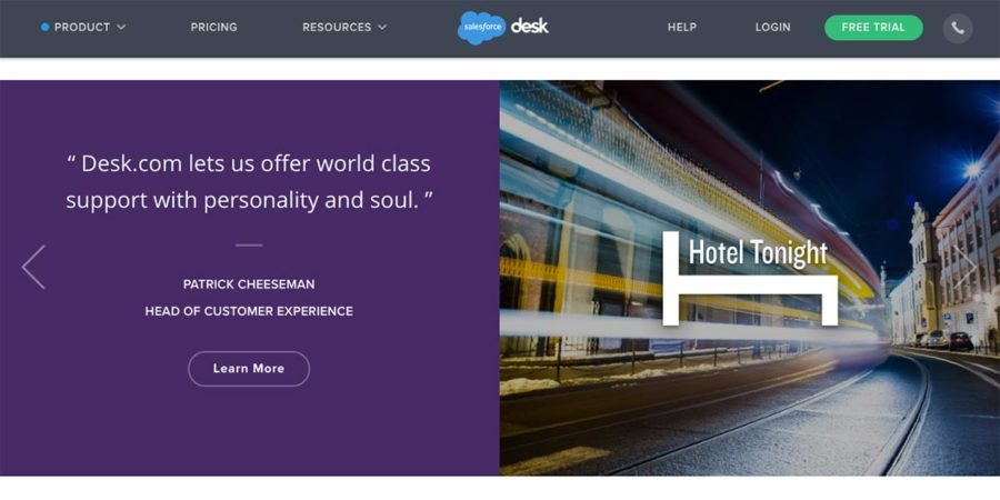
Take a look at how Salesforce Help Desk does this in the example. Their testimonial from Hotel Tonight is bold, takes up a lot of space, and is positioned cleanly next to the brand’s logo. You can’t miss it.
However, if you feel as though that takes up too much space, considering adding testimonials to a slider on your landing page. They’ll take up less room, but they’ll still be easy to spot.
Experiment with adding testimonials next to your call to action button, too. Positive feedback from another customer could be just the thing a hesitant customer needs to convince them to click your button and take action.
It’s also a good idea to add testimonials to your product pages, with 88% of customers saying they trust online reviews as though they were the personal recommendation of a friend.
Ask For Feedback
Lastly, because no one knows your customers better than your customers themselves, it’s important that you ask for feedback. Once you know exactly what your customers want, you can make the necessary changes to your website that can boost conversion rates.
Customers are always happy to give feedback, be it in the form of a customer satisfaction survey or a poll. It shows that you’re committed to listening to them, and giving them more of what they want.
You can use email to carry out a survey or social media, and tools like Survey Monkey can help you. Make sure that any customer you invite to participate has already been engaging with your brand for at least 3 months, and wait at least 2 months before re-asking an unresponsive customer to respond.
The exact questions you ask will depend on your business, but all questions need to be geared towards improving your conversion rates. For example, TeeSpring wanted to find out if customers were unhappy about being charged upfront for items that were actually being crowdfunded.
They A/B tested a CTA which eliminated a key objection from customers (being charged immediately) and were able to increase their conversion rate by 12.7%.
Set goals, have your buyer persona in mind, and then ask a series of questions that you think will help you to understand more about what your customers want.
Final thoughts
All in all, the more experiments you perform, the better your conversion rate will be. As long as you know your audience and what they want to see, things will pick up.
Don’t stop once results improve. Keep tweaking, keep monitoring, and keep improving!


