

In a world where the average landing page converts at just 2.35%, businesses need to do everything they can to stand out.
One key way to reduce your bounce rate and keep users progressing through your funnel is to create a compelling call to action (CTA.)
In this article, we’ll look at what can you learn from the most innovative brands about creating CTAs that increase both engagement and conversions.
What is a call to action?
A call to action is any message on your site that prompts or encourages a visitor to take the next step or perform an action. Usually, a CTA takes the form of a quick phrase written on a clickable button, such as “sign up,” “talk to sales,” “subscribe,” or “read more.”
In 2019, most call to actions are created through a marketing automation software — but they can also be hardcoded onto a site. You’ll most often see CTAs incorporated on homepages, landing pages, pop-ups, and blog posts.
A clear and compelling call to action can nudge the users in a direction that helps both the visitor and the site owner achieve their respective goals. When done well, a CTA feels like the natural next step for a user, not a jarring or desperate plea for attention. The best CTAs exist to teach, delight, and engage.
Call to action phrases & examples that work
There are virtually limitless different ways of building CTA’s and incorporating them into your site.
Keep in mind that a CTA is much more than just a few words on a button asking the user to do something. A great CTA is a piece of marketing collateral that should incorporate killer copy, beautiful design, and cutting edge psychology.
Overall, they should also be short, informative, and ideally create a sense of urgency for a user.
Check out these examples of call to action buttons from high performing businesses across a variety of industries:
1. Proof
CTA Button: Request an invite

Exclusivity can be a great part of a marketing strategy. The email marketing software Superhuman has created a ton of buzz in large part due to their 100,000+ person waitlist.
If you don’t want to roll out your product to anyone and everyone, consider a “request an invite” CTA such as the one we use on our new Personalization microsite. This can generate a list of potential customers and build some hype around your company.
Our call to action also promises “Early Access”, which hints at the value that can only be unlocked if you sign up.
2. HubSpot
CTA Button: Get free CRM
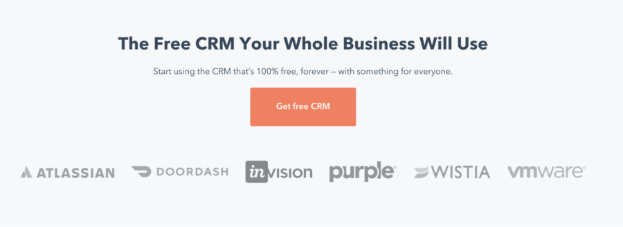
HubSpot’s CTA example delivers a particularly to-the-point message to visitors. By reiterating free on the button, they make it clear to the visitor that they don’t have to pay on the next page. That takes away any apprehension a visitor might have to take an action.
It’s also important to note that this CTA works particularly well because the product, HubSpot CRM, has a short and sweet name. This style of button might not work as well with long product names such as Try free accounting software.
3. SaaStr
CTA Button: How do I…?

SaaStr’s CTA example is a great reminder of how some rules are meant to be broken. Their call to action does not send the user to another page right away, but rather encourages users to type a question.
This strategy, especially when they prompt you to ask “how do I hire a great VP of sales?” builds up SaaStr as an authority that can help you with just about anything startup related.
4. Peloton
CTA Button: Learn more
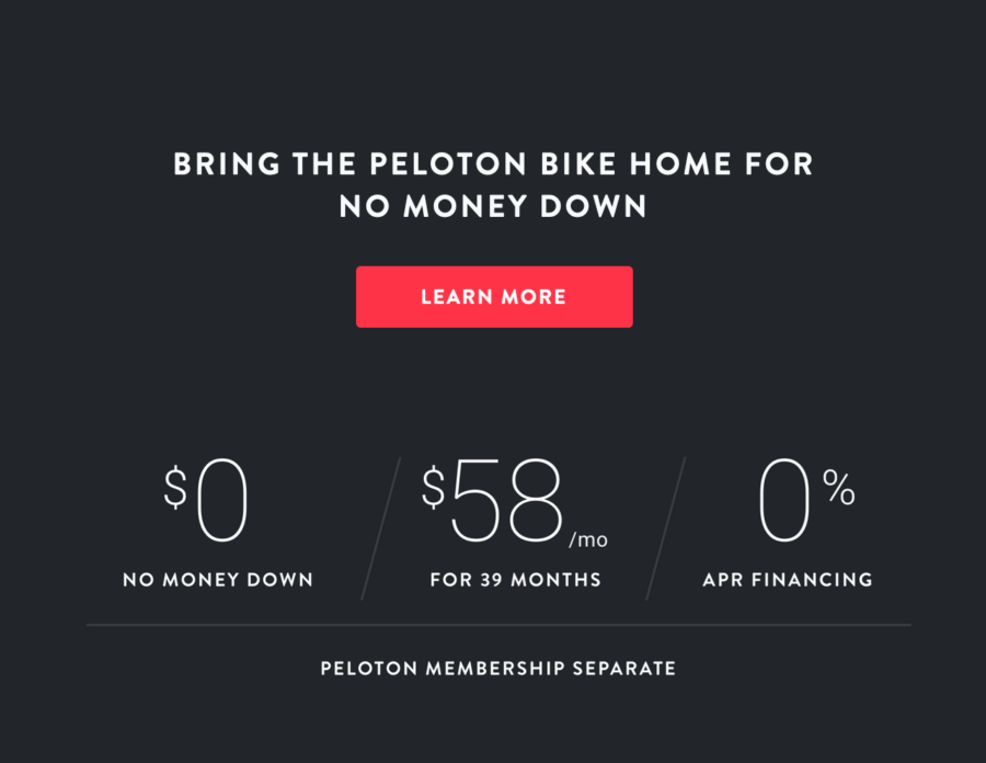
Peloton is a fitness company known for offering high-end home exercise bikes. But they also want to appeal to the masses. That’s exactly why their homepage features an offer of financing with very reasonable terms and an indication of “No Money Down.”
“Learn more” is both a simple and effective way of letting a visitor know that financing requires a bit of explanation. Then, the simplicity of the CTA sets the expectation that the process will be smooth and painless.
5. Spotify
CTA Button: Get Spotify free
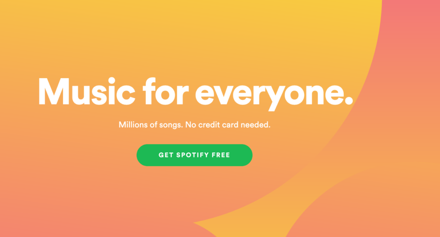
Spotify has a clean, colorful, and creative homepage — alongside a simple CTA. Note that they don’t just ask the user to “get Spotify,” but to “get Spotify free.”
That’s key. When something is free it is much more likely that people will give it a try, so it’s a powerful word to use in a call to action.
6. Stickermule
CTA Button: Shop now & Get samples
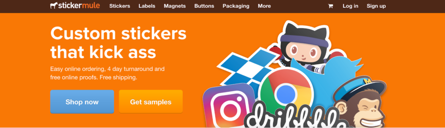
Stickermule deftly places two call to actions side by side on the homepage of their site. It’s likely that their marketing team ran an experiment and learned that those are two of the highest value actions a user can take.
Then, they came to the conclusion, “Why not put them front and center on the homepage and give a user choice?”
Those who know what they want can get right to shopping, and the users who want samples can access them easily. It helps that both those options are great for the team at stickermule, so it’s a win-win.
Also note that “shop now ” is highlighted in a contrasting blue button color, so that it really draws the eye from the orange backdrop of the site — a slight nudge towards the more valuable of the two CTAs.
7. Drift
CTA Button: See Drift on your site
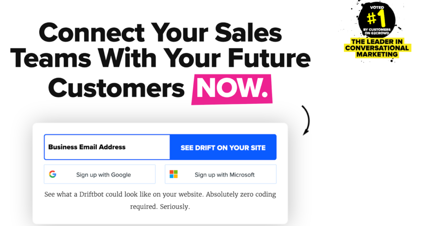
Studies show that our brains light up at the idea of instant gratification. Some great CTAs will leverage this bit of psychology by including words that imply a quick and easy to implement solution.
By using the word now in the headline and “see Drift on your site” on the button, a visitor to Drfit’s homepage feels like a boost to their sales is only a click away.
8. Treehouse
CTA Button: Claim your free trial
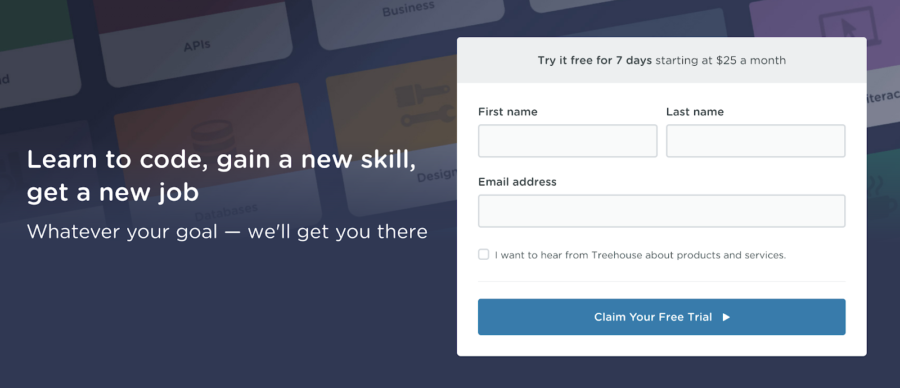
Treehouse’s CTA adds a subtle, yet effective twist on a button that might normally just read “start your free trial.”
By using the word claim rather than start, they imply that the free trial is valuable and worthy of some effort. To claim something takes some time, but in most cases, it’s worth it.
People claim a winning lottery ticket, for instance.
9. Hotjar
CTA Button: Subscribe
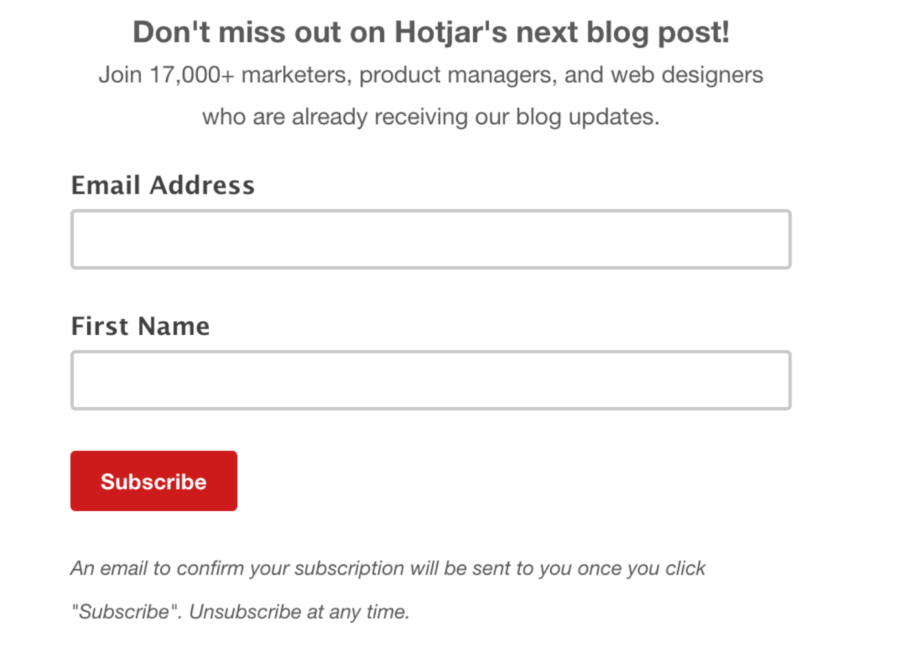
Building up an email list is a great way of building up your pipeline and nurturing your current customers into valuable readers. In order to keep them interested, you have to be able to provide them with quality content — time and time again.
By using “Subscribe” on their call to action button instead of “Sign up,” Hotjar makes their blog feel more like a publication worth reading. You subscribe to the New York Times, you don’t sign up.
This is a subtle yet effective way of growing your readership and email list. If you want to know more about analyzing your site and finding opportunities to grow your email list, check out Hotjar’s comprehensive guide to website analysis.
10. Backlinko
CTA Button: Click to access the case study
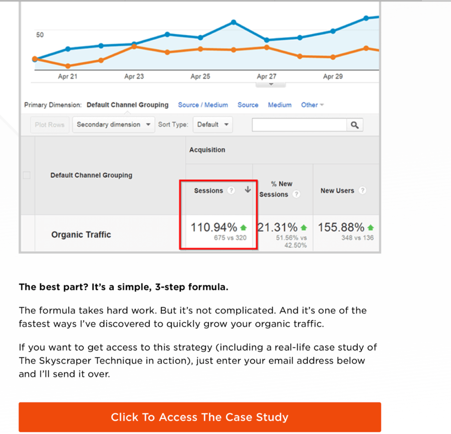
Accessing a case study just feels like a high-level, important action.
Imagine how much less formidable that action it would sound if the CTA read, “Click to get the information.” Backlinko is making the user feel like they are important, which is always a good idea.
11. Pagerduty
CTA Button: See what they’re saying
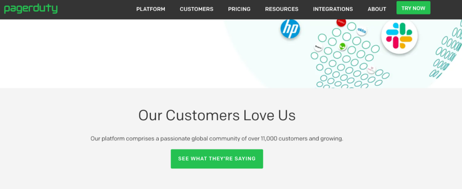
Pagerduty puts a unique and updated spin on the CTA that is focused on highlighting customer stories.
On certain points of the site, they use strong, evocative words such as “love” — to catch the eye of someone casually scrolling down the page.
Similarly, they opt for creative button copy such as “See what they’re saying.” This is a clever tactic because that language is clever, so the button stands out, and it carries a sense of longing.
Most people don’t feel much when a CTA asks them to “read more.” What that really want after clicking this button is to see what other customers are saying.
12. Buzzsumo
CTA Button: Go!
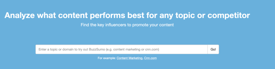
Similar to the SaaStr example above, BuzzSumo incorporates an interactive component by asking the user to enter information and try out the product. They also use quite possibly the quickest and most to the point call to action example: “Go!”
It evokes a feeling that they will get you the information you need quickly and introduces a bit of playfulness in a way that is both fresh and unexpected. Imagine how much less fun it would be if the CTA was “Search.”
13. Uber
CTA Button: Sign up
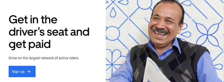
Uber keeps their driver acquisition site plain and simple — which makes sense given that they are targeting people who have probably heard of the ridesharing company and therefore don’t need any additional information.
If they’ve navigated to this page, they are serious about driving for Uber. By cutting right to the chase, Uber comes across as a company that is serious about efficiency.
14. Instagram
CTA Buttons: Log in with Facebook, Sign Up, Download on the app store, Get it on Google Play
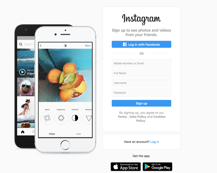
This desktop landing page for Instagram primarily tries to get users to access their account with the CTAs, “Log in with Facebook” and “Sign Up.”
But this page also does something very wise with regards to its CTAs. Since the vast majority of Instagram users are on mobile, the desktop version of the app smartly points users toward the App Store and Google Play Store. It’s a good reminder that no one knows your ideal customer better than you, so use your CTAs to send your visitors where they will get the most value, no matter what platform they visit you on.
15. Chewy
CTA Button: Shop Now
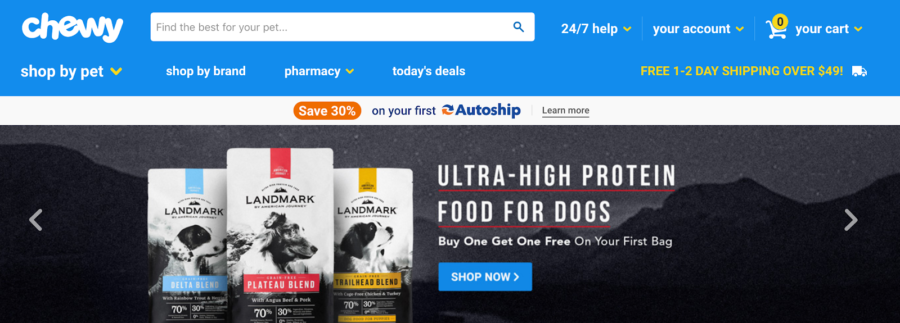
Almost all of Chewy’s CTAs combines a potent combination — they offer a deal and a way to quickly access the deal.
It’s the perfect way to entice online shoppers. Plus, the bright blue “shop now” makes the user feel like their savings are right at their fingertips.
16. Kayak
CTA Button: Let’s do this
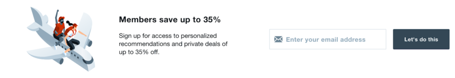
Kayak is a travel site that appeals to everyone, but especially to the adventurous and impulsive souls who might be interested in booking an exotic trip on a whim.
For that reason, it makes sense that this call to action example does not use traditional language such as “sign up.”
“Let’s do this” embodies the loose and daring vibe that appeals to Kayak’s target audience.
17. Quicksprout
CTA Button: Start now
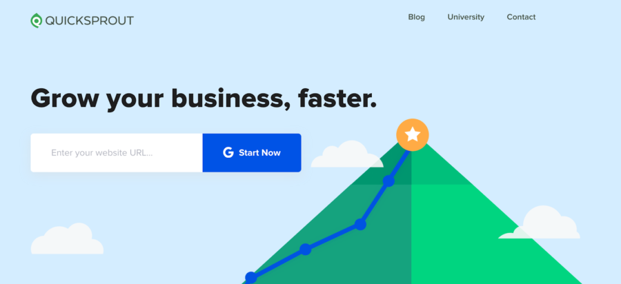
This CTA for Quicksprout exudes confidence.
All they need is your URL, and they can get started growing your business… fast. The simplicity, clean design, and use of white space are all to be admired on this page.
18. Blueleadz
CTA Button: See Our Approach and Let’s Talk
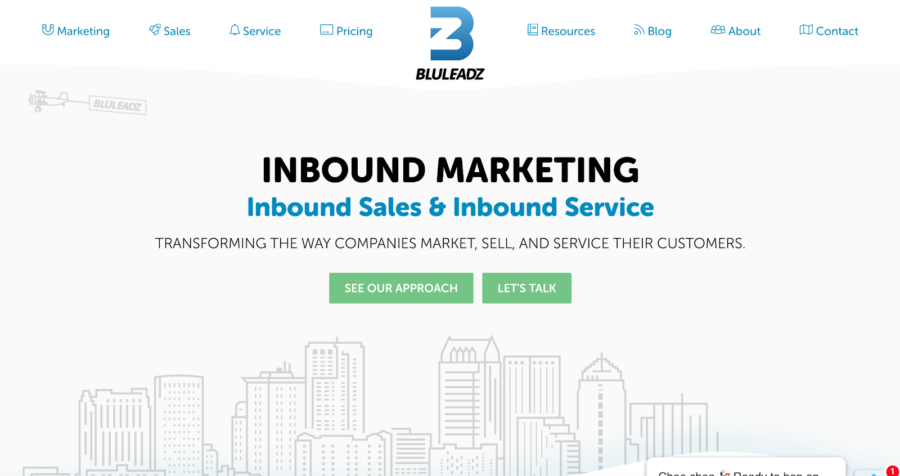
Blueleadz understands that they are not a household name.
For that reason, their CTAs are optimized for the user who is intrigued enough to take action, but might still want to learn a bit more about their brand.
Instead of using a more generic “learn more” CTA, they spark curiosity by using less common phrases such as “see our approach” and “let’s talk.”
The conversational tone indicates an openness to listening to a customer’s needs and being flexible in implementing a customer’s feedback.
19. Apple AirPods
CTA Button: Watch the film
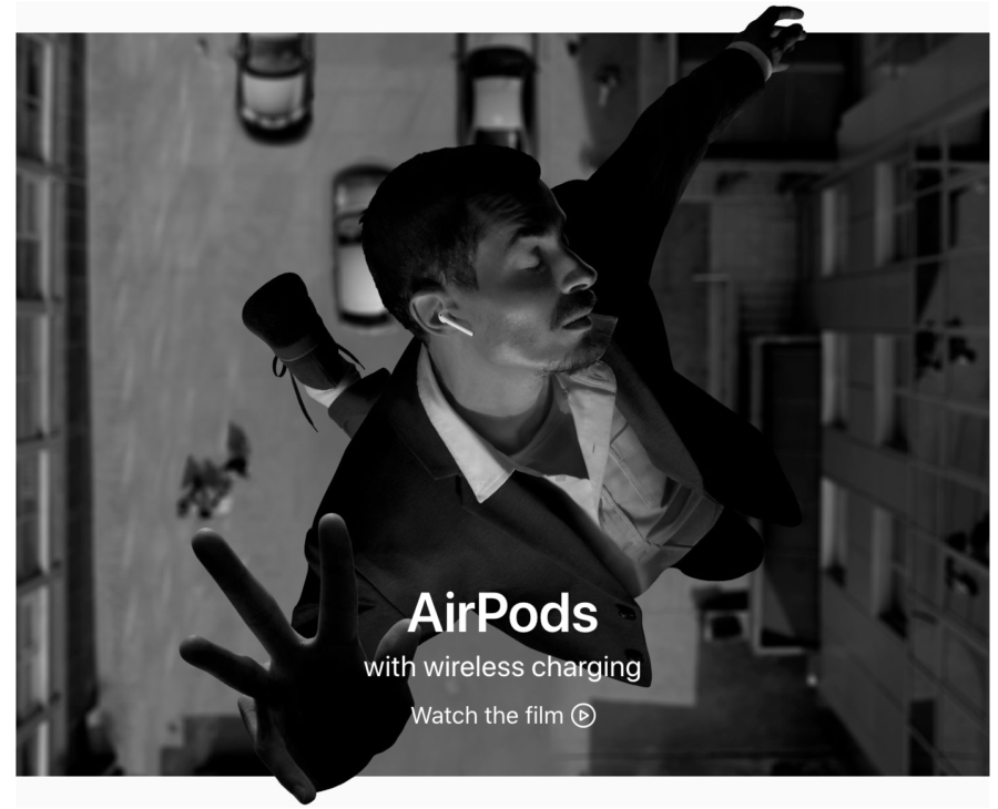
When scrolling down Apple’s homepage, the first CTA for AirPods is not a conventional “Buy Now” call to action button, but a provocative “Watch the film” CTA.
You heard that right: a film, not a movie. They are indicating that their product is worthy of your money — so much so that it has inspired an entire cinematic works.
20. Algolia
CTA Button: Evaluate your site
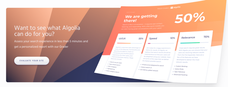
The word evaluate has both technical and analytical undertones. Evaluations are not easy — they take work and specific knowledge.
Algolia is making the user feel like they are getting a real service if they click that CTA. Plus, the white button with the drop shadow is crisp and clean. Clever CTA copy, clean design.
21. Amplitude
CTA Button: Explore demo now

Once again, we see the use of a single (and seemingly basic) word having a big impact on the feel of a CTA. By clicking this orange call to action button, you are not just getting a demo, you are granted the opportunity to explore it.
There is the implication that Amplitude has a substantial and useful demo that is worth checking out at length. Plus, we love their use of Orange against white — it makes the CTA really pop off the page.
22. Conversion XL
CTA Button: Sign me up
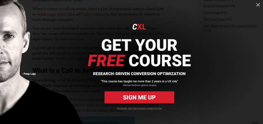
“Sign me up” feels way, way different from the more commonly used “sign up.”
It makes the user feel like they are committing to something. Also, it feels personal, intimate, and intriguing.
The style of this popup reinforces those notions, as it looks like Peep Laja of ConversionXL (a guest on Scale or Die Season 2) is staring into your soul (in a good way.)
23. Slack
CTA Button: View all customer stories
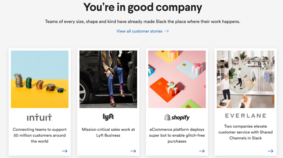
Few things are as powerful at boosting conversions as social proof, so it makes sense that Slack would want to emphasize their notable customers as part of this homepage CTA.
They do a great job of showing logos of massive, impressive companies, proving a snapshot of what they accomplished — but leaving the majority of the information behind the button.
You want to find out everything they did for Everlane? Better click the call to action to find out.
24. Clearbit
CTA Button: Get started
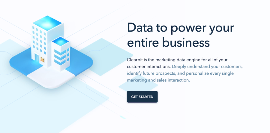
“Get started” is a simple, albeit effective CTA. The saying has an uplifting, optimistic feel to it.
Clearbit is effectively saying, “yeah, it might sound hard to implement a marketing data engine, but it’s really not that bad. Just click the button and get started.”
25. Lemonade
CTA Button: Check our prices
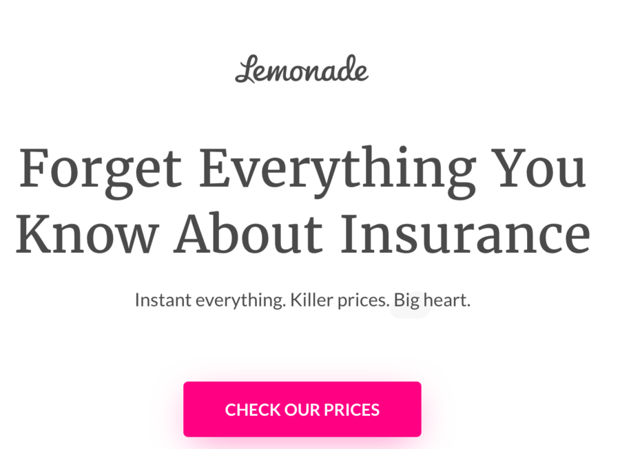
If you stake your reputation on something decisive, such as having the best prices, why not make that explicit in your call to action?
That’s exactly what Lemonade does. It’s a bold move, and one that makes the visitor feel like Lemonade must be doing something right if they can so confidently stand behind their product.
26. Equinox
CTA Button: Visit a club and member benefits

Equinox fitness club smartly embraces seasonality with this one.
The motivating copy and time-sensitivity of the offer give the CTA a sense of urgency. Just looking at it makes you want to hit the gym, but it does so in a low-pressure way.
The two buttons provide two routes: an option to fast track your way to a workout or the route to simply learn more information.
27. Nike
CTA Button: Shop and watch

Speaking of timely, Nike introduced a beautifully rendered CTA almost immediately after the US women’s soccer team clinched gold in the 2019 World Cup. Placing the “shop” CTA so close to “watch” cleverly blurs the line between commerce and entertainment.
Sure, Nike wants you to buy athletic gear, but they are also honoring a historic moment. The combination makes for a compelling call to action.
28. Zoom
CTA Button: Get on the guest list
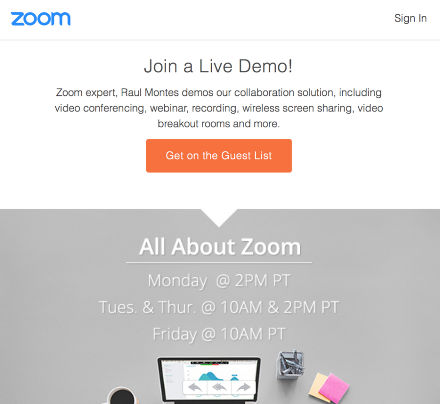
Tech (and recent Wall Street) darling Zoom gets creative with how they promote their demos.
Whereas some companies might not put much thought into something as standard as a CTA for a demo, Zoom leverages basic psychology to make their demo stand out. Guest lists are normally reserved for exclusive events, and the phrase evokes feelings of not wanting to miss out.
Creative language like this is a low lift way of making a normally boring call to action come to life.
29. Wistia
CTA Button: Start for free, Explore and learn
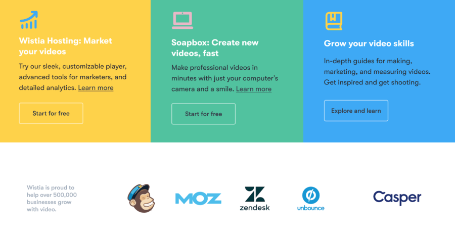
This Wistia 3-in-1 CTA module on their homepage incorporates several elements of effective CTAs — and then takes it a step further, rolling them into a single attractive package.
With this page, they show off their multiple product capabilities in a condensed, colorful, and easy to understand way — and the CTAs make it clear what value they are providing. The use of logos from MailChimp to Casper as social proof is the icing on the cake that lends legitimacy to the CTAs above.
30. MVMT
CTA Button: Shop our Instagram
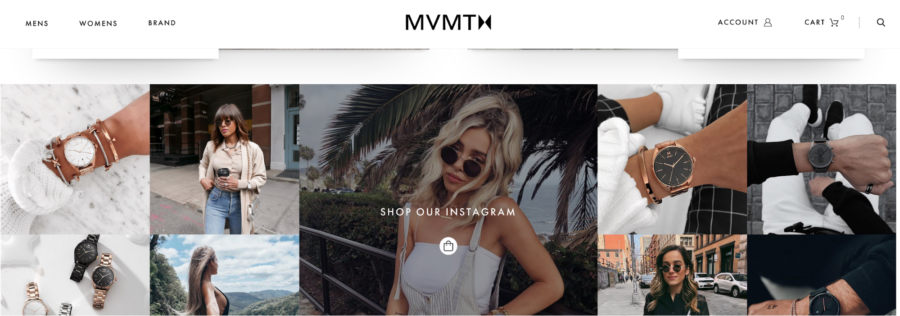
Watch company MVMT is doing a variation on the more traditional and concise CTA: “shop.” MVMT knows that their bread and butter is purchases made off their Instagram, so they make that clear in their CTA.
Their use of Instagram images around the CTA is sure to attract the type of user they want.
31. AYR
CTA Button: I want in

Ecommerce company AYR uses forceful, arresting language in this popup. No one wants to feel FOMO. We are hardwired to want to be part of tribes, to be part of the in-crowd, so using that sort of language taps into some deep-rooted feelings for most of us.
While this is approach is not necessarily appropriate for every type of product, you should play around with CTAs that make people feel like they are missing something wonderful if they don’t click.
32. 23andMe
CTA Button: Shop now

This 23andMe CTA is a great example of how even the most basic and most used CTA of them all — can feel fresh when paired with bright colors, fun pictures, and interesting copy. Once 23andMe ropes you in with their design and the idea that there is a very easy way of living a healthier life, all they need is a basic CTA to seal the deal.
33. GetHarvest
CTA Button: Learn more about Team
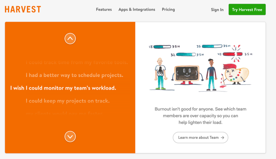
Harvest has built what amounts to a “choose your own CTA” adventure.
They provide a scrollable list that highlights their different features, a description, an adorable illustration, and a custom CTA. It’s a fun and different way of compressing a lot of information into a small space.
Good luck — and most importantly, remember to test
There are many call to action examples as there are many types of businesses.
The one that fits best for you will probably incorporate several elements found on this list. That being the case, remember a key tenant of the growth marketers ethos: always be testing. If you try out multiple CTAs and see how they convert, you’ll be able to find the perfect one for your company.


