

You’ve probably heard the merits of A/B testing for quite a while — it seems to be one of those topics that digital marketers just can’t seem to stop yapping about. But that’s for good reason!
Data-driven marketers are constantly testing. Not only do they possess a growth mindset, they also don’t make rash decisions. They wait for data before changing course — always focused on increasing their KPIs.
We built Proof for this type of data-driven marketer.
And since we launched A/B testing this past October, we’ve been searching for ways to help data-driven marketers like you get started and find the most value from our A/B testing feature. We’ve been using this feature on our own campaigns, and after gathering some initial data on our end, we have some great ideas for you to get started with a test of your own.
Looking for A/B test ideas to quickly implement in your Proof account? Here are 10 ideas our team has used to get record-setting conversion rates for our brand:
- Proof vs No Proof
- Notification vs Notification
- 4 Notifications vs 1 Notification
- URL vs URL
- Display time vs Display time
- Delayed trigger vs Immediate trigger
- Design vs Design
- Adjective vs Adjective
- Trigger vs Trigger
- Mobile & Desktop vs Desktop
1) Proof vs No Proof
One of the most powerful tests you can run on any page is testing Proof Notifications on the page versus no Proof Notifications. While we’re confident that Proof can help you increase your conversion rate 10-15% (or more) across your site, we’d be arrogant if we blindly declared that it works for every page. That’d be like mindlessly announcing an A/B test winner before gathering any data!
The rationale for this test is best explained through an example:
Let’s say you run a PR agency. If you launch a campaign displaying notifications such as “John from Topeka, KS just signed up” — it might not be the idea to get visitors to trust your firm for crisis PR. Visitors might be turned off from your level of discretion, especially since privacy is probably a top concern for your potential clients.
Testing Proof vs No Proof on pages is a great way to see scenarios where Proof works best for your funnel and more importantly, where and when it doesn’t. We’re confident that Proof will work somewhere on your site, and we want A/B testing to help you find the best spots to launch it.
How to set up this test:
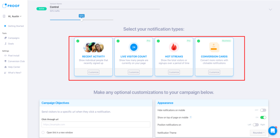
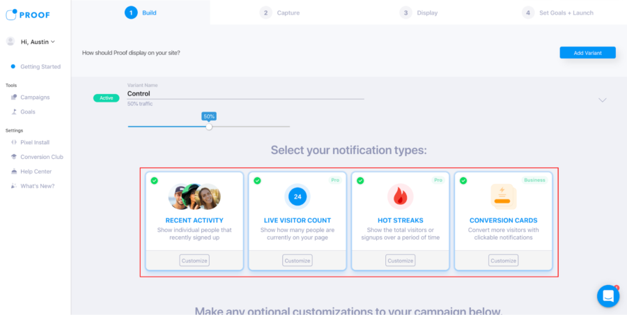
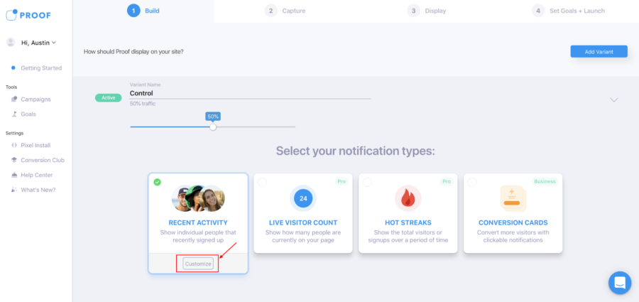
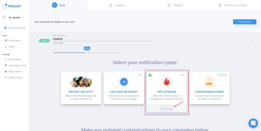
Step 1: Set your control to include all the Proof Notifications that you want to test on a page. You can run all four Notifications on the page at once (as pictured above — all four have green check marks). Alternatively, you can independently select one type of Notification.
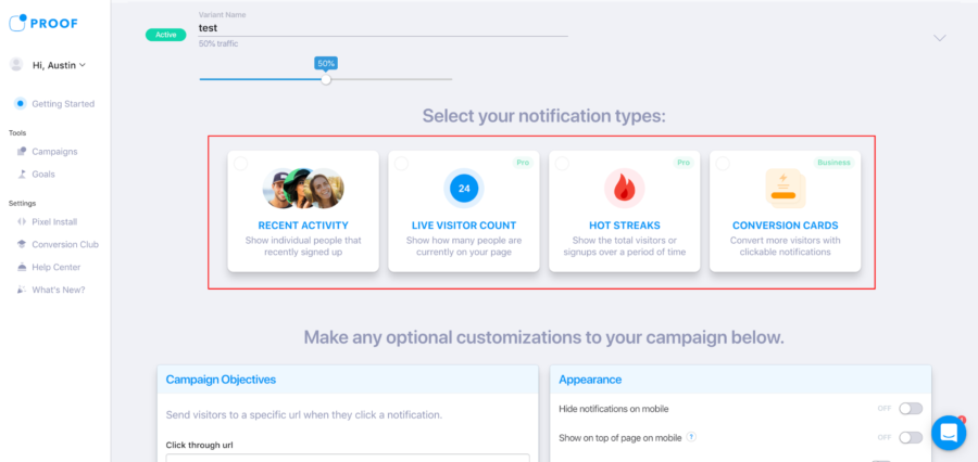
Step 2: Create a variant with no Notification types selected. Uncheck the green check marks on all four Notification types — Recent Activity, Live Visitor Count, Hot Streak, and Conversion Cards (as pictured above). And there you have it, you’re ready to launch this test of Proof vs No Proof!
2) Notification vs Notification
One of our favorite A/B tests to run is one Notification types versus another one of our Notification types.
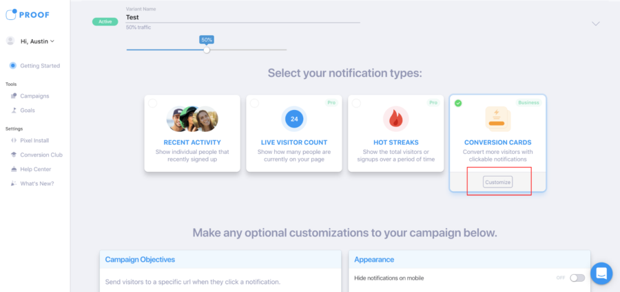
At Proof, we have four Notifications from which you can choose to display on your campaigns:
- Recent Activity — Shows individual people that recently signed up
- Live Visitor Count — Shows how many people are currently on your site
- Hot Streaks — Shows the total number of visitors or sign-ups over a period of time
- Conversion Cards — Convert more visitors with clickable notifications
When you put these notifications head to head, you can run the following 6 tests:
- Hot Streaks vs Live Visitor Count
- Recent Activity vs Hot Streaks
- Live Visitor Count vs Recent Activity
- Conversion Cards vs Hot Streaks
- Conversion Cards vs Recent Activity
- Conversion Cards vs Live Visitor Count
How to set up this test:
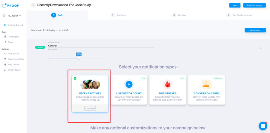
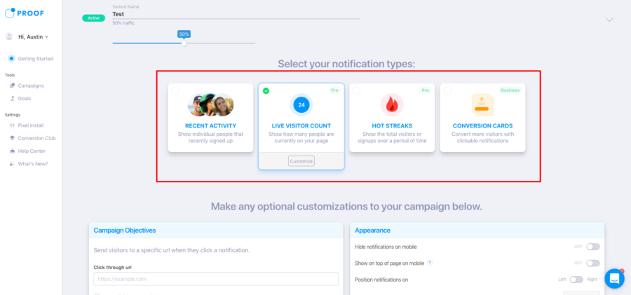
Step 1: Set your control to a Notification you want to display — either Recent Activity, Live Visitor Count, Hot Streaks, or Conversion Cards. To select a notification, simply click the Notification type you want to launch and a green check will appear at the top left corner of the card.
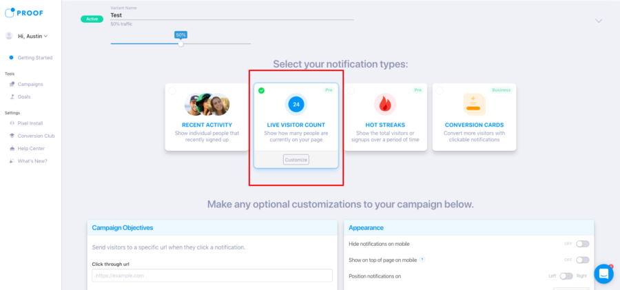
Step 2: Set your variation to the Notification you want to test against your control. Again, simply click the desired Notification type and a green check will appear. For the variation, just be sure to choose a different Notification type than you did in Step 1.
3) 4 Notifications vs 1 Notification
What’s better than running 1 Notification on a page? Running 2, 3, or 4 different Notifications on a page!
Well, maybe…
First, you need to run an A/B test to verify your hunch! An A/B test can help you determine how many notifications you should alternate displaying on a page with the Proof pixel installed.
You’re able to A/B test rotating between all 4 Notifications or just 1, 2 or 3 Notifications.
How to set up this test:
Step 1: Set half of your traffic to see a set number of Proof Notification types on a page. In this scenario, we’re going to be testing all 4 Proof Notifications versus 1 Proof Notification. We select Recent Activity, Live Visitor Count, Hot Streaks, and Conversion Cards by clicking the green check marks at the top left of each card.
Step 2: Next, set the other portion of your traffic to display a different number of Notification types (in this scenario, we’re setting only Live Visitor Count for the variant — since we set the control to rotate between all 4). Again, to set the Notification types you want to display, click the check marks on the top left of each card you want to be included in your rotation.
4) URL vs URL
Did you know you can set you Proof Notifications to send traffic to different click-through URLs? That means that when a visitor clicks the Proof Notification on your page, you can forward the traffic to another high-value page somewhere else on your site.
One powerful A/B test is to segment traffic to two separate URLs and see which URL converts better.
You can run part of your traffic to a checkout page and another to a product page. Or you could run part of your traffic to your homepage and part to your blog — the A/B test you can run here are only limited by your imagination!
How to set up this test:
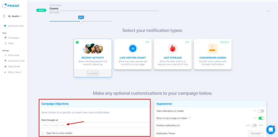
Step 1: When setting up your Control, navigate to the Campaign Objectives section on the bottom left of the screen. Type in the Click through URL that you want to direct your traffic towards when they click a Proof Notification.
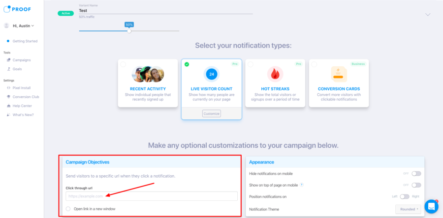
Step 2: Next, set up your variant towards a different URL. Once again, navigate to the Campaign Objectives section. Type in another, different click-through URL — and voila, you’re ready to launch!
5) Display time vs Display time
The length at which Notifications stay on a screen can greatly affect your conversion rate. As a marketer, you may have a theory that a longer display time of a Proof Notification could help your audience have a more authentic engagement with the alert. For instance, maybe seeing “James from Austin, TX just signed up” might make a visitor start thinking about who James is, and what caused him to take action.
On the contrary, you might be of the mindset that “more activity = more sales.” You may want many Notifications to stream onto a page while a visitor looks around the site. This is especially important if the average session duration for a page is lower than other parts of your funnel.
How to set up this test:
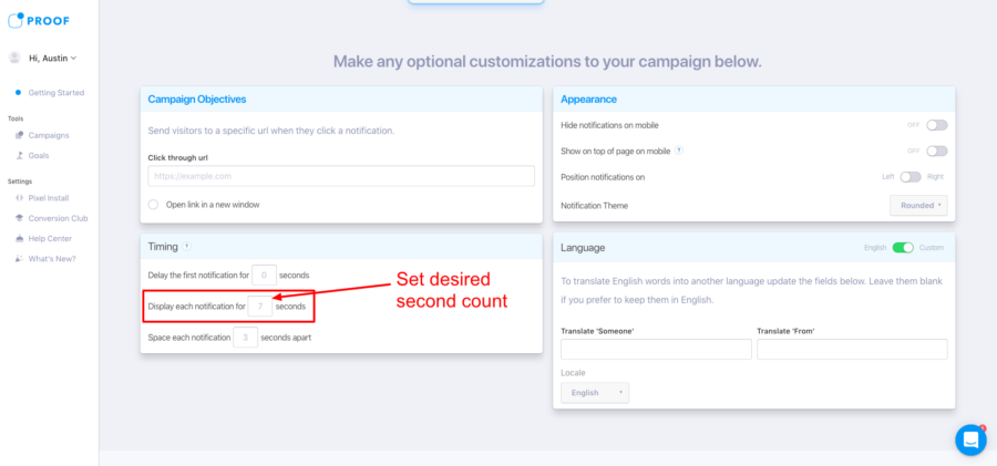
In this scenario, we’ll set up a 7-second display vs 5-second display to see what works best for your brand.
Step 1: Under your Control, navigate to the Timing section at the bottom left corner of the page. By default, the timing should be set to 7 seconds. Set the timing to 7 seconds or any other second count that you want to test.
Step 2: Next, navigate to your Variant. Here you’ll once again go to the Timing section at the bottom left corner of the page. Set the time to 5 seconds or any other time period that you want to test. And you’re off!
6) Delayed trigger vs Immediate trigger
You likely have certain parts of your site where you’d rather a visitor spend more time on a page — reading the copy, scrolling through photos, engaging with elements on the page — before they see your Proof Notification.
As a marketer, you know better than anyone that timing is imperative for the success of your campaign.
Displaying the right product at the right place at the right time is a key to a successful marketing campaign. That’s why we find the delayed trigger A/B test extremely interesting to run on our landing pages.
With Proof, Notifications display immediately by default. But that doesn’t have to be the case!
You can manually adjust the second count delay on any Notification to be as long as you’d like. Generate a hypothesis about how long you think customers should interact with a page before seeing Proof, and then validate your hunch by running an A/B test.
How to set up this test:
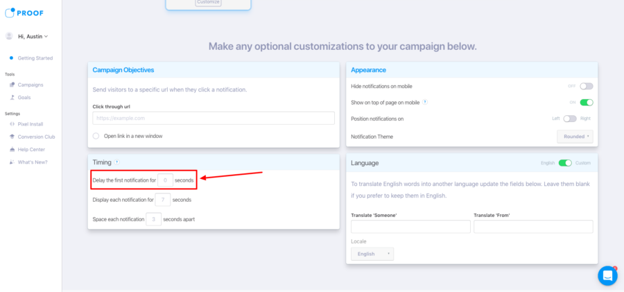
Step 1: For your control, scroll to the timing section. We suggest setting the delay for your control to a 0-second delay — to gather some baseline data.
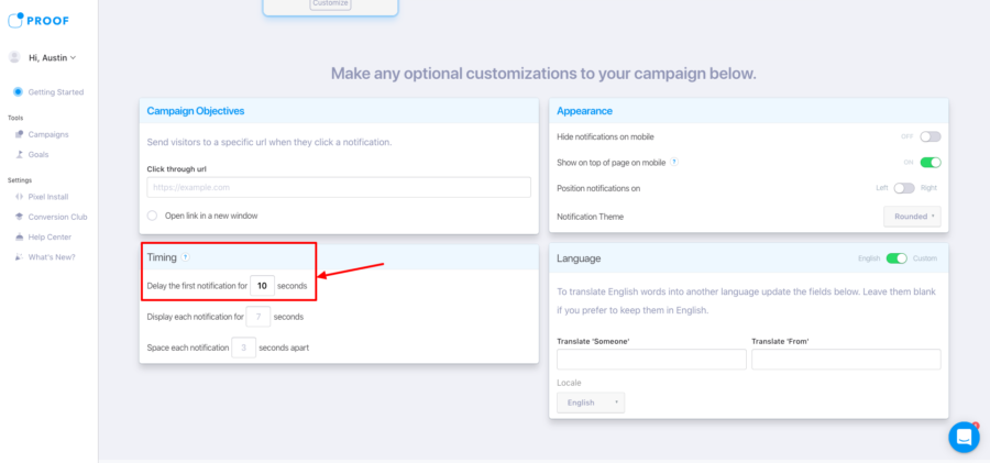
Step 2: For your variation, scroll to the timing section once again. Adjust the delay to however long you want your Notification to be delayed by. In our example, we have the Notification delayed by 10 seconds to give our visitor time to look around the site.
7) Design vs Design
The design of a page is one of the biggest factors that influences the action a visitor takes when on your site. So it’s not surprising that where and how you display your Proof Notification on the screen can have an effect on how your visitors respond to the page.
There are 3 major design changes you can easily test with your Notifications on Proof:
Rounded vs Box
The default design for Proof includes rounded corners. But you might want to test a more boxy design to better match the styling of your own site. It’s an easy test to run, and it could quickly provide more conversions for your campaign by matching your Proof Notification to your site’s style guide.
How to set up this test:
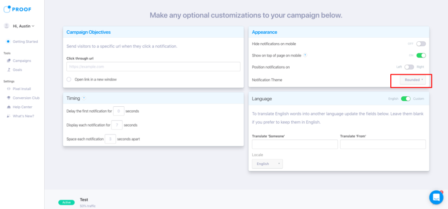
Step 1: Under your Control group, go to the Optional Customization section. Then Navigate to the Appearance section on the top right.
Under Notification Theme, make sure the drop-down is set to Rounded for this portion of your traffic.
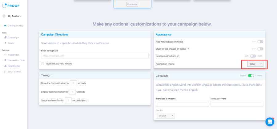
Step 2: Under your Variation, go to the Optional Customization section. Then Navigate to the Appearance section once again.
Under Notification Theme, select the dropdown for Boxy for this portion of your traffic.
Left vs Right
Another default setting for Proof is that the Notification displays on the bottom left corner of the screen. But that might not be the best spot for your unique site! Why not run a test and see if your traffic prefers seeing Proof on the left or on the right?
Note: Be cautious with this test when running multiple software plugins on a page — i.e. Intercom, Zendesk, or Drift — as moving the Proof Notification could cause overlap.
How to set up this test:
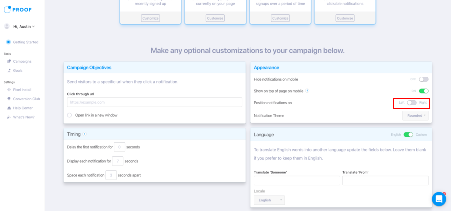
Step 1: Navigate to the Optional Customization section for your Control group. Then head to the Appearance panel. Set the toggle to Left for this section of your traffic.
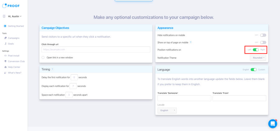
Step 2: Navigate to the Optional Customization section for your Variation group. Then head to the Appearance section. Set the toggle to Right for your variation.
Custom Image vs Default Image
By default, Recent Activity Notifications load an image of the customer’s location on a map. But you’re also able to change this to display a custom image — such as your site’s logo. This can be an insightful test for many brands.
How to set up this test:
Step 1: For your control group, make sure you select Recent Activity under Select your notification types. If you’re wanting to display the Customer’s location, you have nothing else to do here. But if you want to put a custom image for your control, click the Customize button at the bottom of the card.
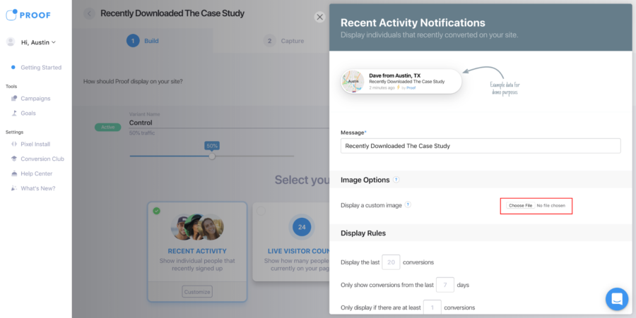
Step 2: On the resulting screen, if you’d like to set a custom image to display, click the Choose File button under Image Options. On the resulting screen, select the file for you image.
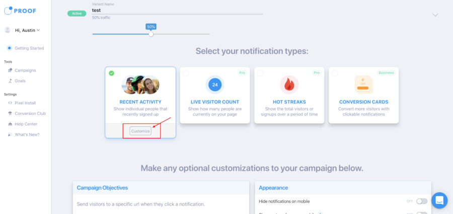
Step 3: For your variation group, make sure you select Recent Activity under Select your notification types. If you’re wanting to display the Customer’s location, you have nothing else to do here. But if you want to put a custom image for your control, click the Customize button at the bottom of the card.
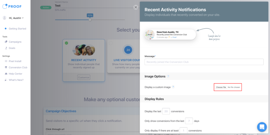
Step 4: On the resulting screen, if you’d like to set a custom image to display, click the Choose File button under Image Options. On the resulting screen, select the file for your image.
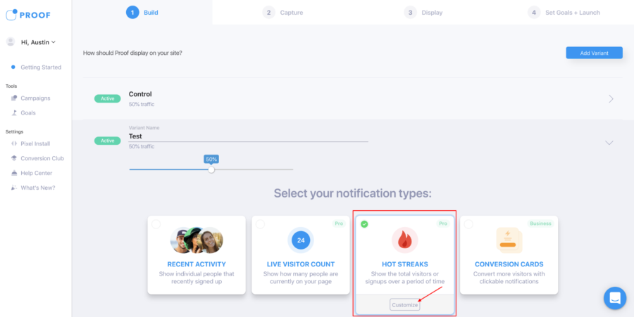
8) Adjective vs Adjective
Words are an important part of convincing anyone to do anything in life. It’s no surprise that tactical and convincing copy is a key part of marketing. You’re most likely already testing headlines on your landing pages and high-traffic parts of your site.
But, did you know that you can also change the copy on your Proof Notifications?
With Live Visitor Count, the Notification displays the word “Visitors” by default. But you’re able to tweak the copy to anything that you find convincing. Try out some personalization techniques that speak directly to your audience.
Sell marketing software? Why not test referring to your visitors as “marketers.”
Have a food delivery app? Maybe call your audience “taco-lovers.”
It’s an easy opportunity to get creative with your diction.
How to set up this test:
Step 1: Navigate to the Notification Selection panel for your Control group. Head to the Hot Streaks Notification on the bottom of the page, and click “Customize.”
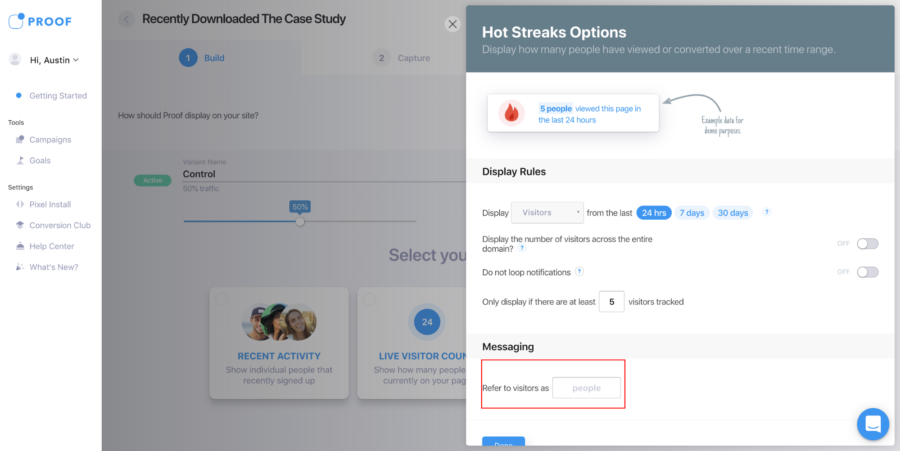
Step 2: On the resulting page, go to the “Messaging” section at the bottom right of the screen. Manually type in what you want to call visitors, and what you want to call the action taken by a visitor for your Control group. By default, Proof will refer to visitors as “people.”
Step 3: Now, navigate to the Notification Selection panel for your Test group. Head to the Hot Streaks Notification on the bottom of the page, and click “Customize.”
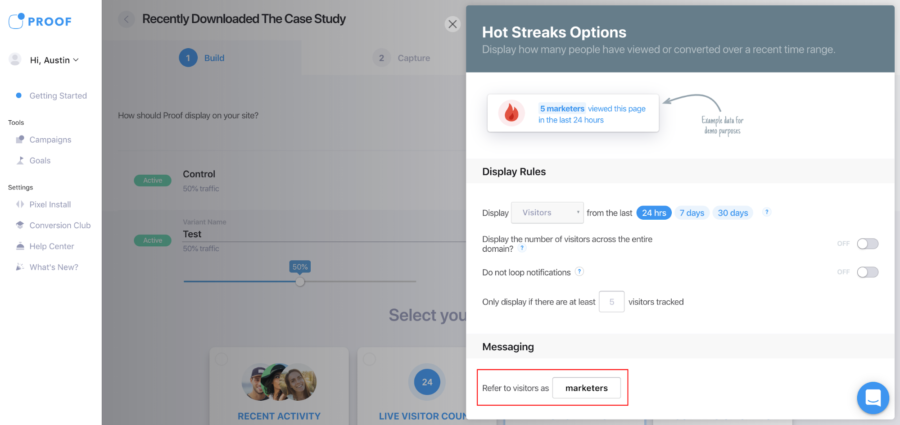
Step 4: On the resulting page, go to the “Messaging” section at the bottom right of the screen. Manually type in what you want to call visitors for this portion of traffic. In our example, we’re testing referring to visitors as “marketers.”
9) Trigger vs Trigger
Conversion Cards is our clickable Notification that can be used as a CTA to move traffic at the exact right time. This particular type of Notification functions a little bit differently than our other products — you’re able it to trigger using one of several different methods.
You can trigger the card when a visitor:
- Clicks on another Notification
- Tries to exit the page (exit intent)
- Scrolls a percent down the page
- Has been on the page for a certain period of time
And again, it’s important to not blindly assume that one trigger will work better than others. Run a quick A/B test to see what resonates most completely with your audience.
How to set up this test:
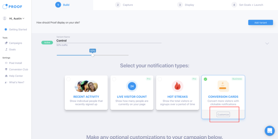
Step 1: Navigate to the Conversion Cards card for the Control group. Then click the button that says Customize.
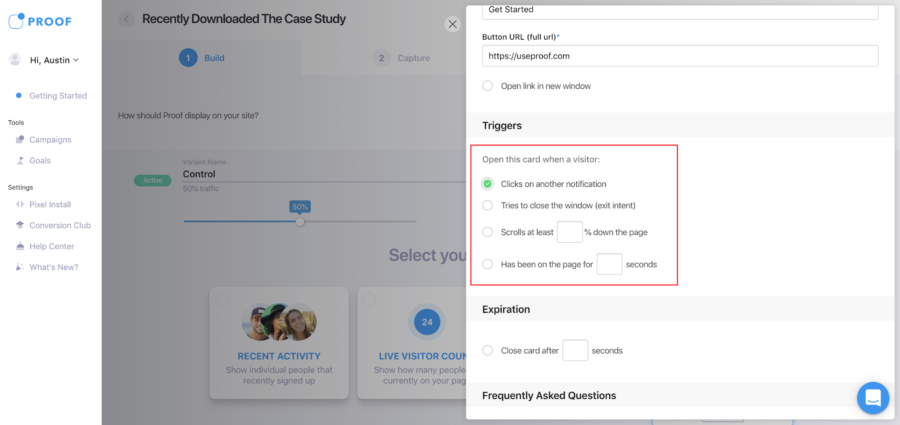
Step 2: On the resulting screen, Navigate to the Triggers section. Select one (or multiple) triggers that you want to set live for you Control group.
Step 3: Navigate to the Conversion Cards card for the Test group. Then click the button that says Customize.
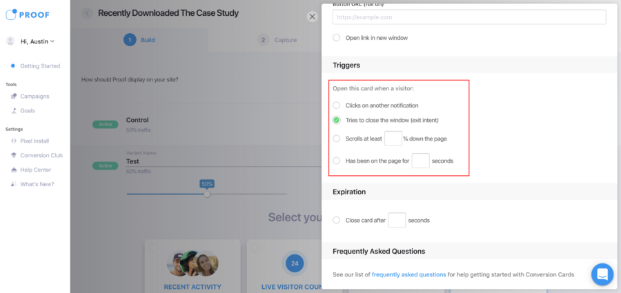
Step 4: On the resulting screen, Navigate to the Triggers section. Select one (or multiple) triggers that you want to set live for you Test group.
10) Mobile & Desktop vs Desktop
Do you treat a website differently on your phone than you do on your computer? If you’re like most people — you certainly do.
For different types of pages, Proof may be more beneficial on mobile or less beneficial on mobile. It really all depends on what type of business you operate and how your users interact with your site.
Don’t simply assume that Proof will do best on Desktop or Mobile — generate a hypothesis and run a test to validate your theory.
How to set up this test:
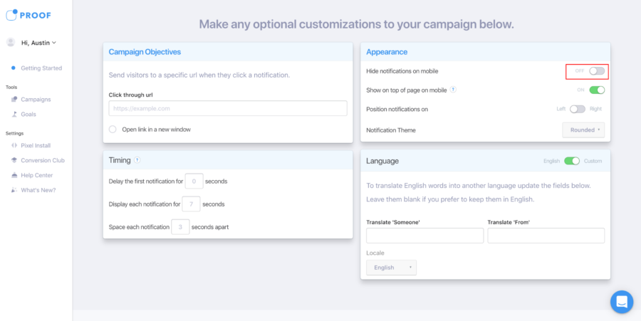
Step 1: First, navigate to your Control group. At the bottom of the page, under Optional Customizations, navigate to the Appearance section. Make sure the toggle for Hide Notifications on Mobile is switched to Off.
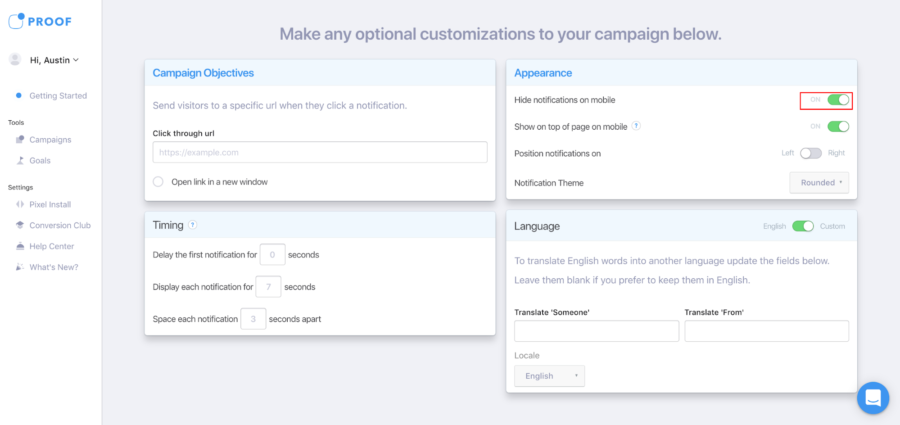
Step 2: Next, navigate to your Test group. At the bottom of the page, under Optional Customizations, navigate to the Appearance section again. Make sure the toggle for Hide Notifications on Mobile is switched to On.
What’s next?
And there you have it! 10 A/B tests to get started with on your Proof campaigns. You’re only limited by your creativity — there are 1000s of tests you’re able to run on Proof and we’re excited to see the ways in which you use this new feature.
If you reach a conversion boost using A/B testing that you’re especially proud about reaching, let us know!
We love celebrating the success of our customers. 🙏🙏🙏


