

The pricing page is an underrated asset for a SaaS business. It’s a chance to experiment, to optimize, and even to have a little fun.
It’s also the last thing a potential user sees before signing up, so it’s the perfect time to make a great impression.
- But how do you go about creating a beautiful, high converting pricing page?
- What elements are must-haves and what should you ignore?
- And what can you tinker with in order to get the most out of your pricing strategy?
Let’s dive in and find some answers, using examples from the pricing pages from some of the top SaaS companies as inspiration.
21 examples of B2B pricing pages
1. Use clean design principles
Zendesk’s pricing page embodies the design concept that less is more. They embrace whitespace, a soothing color palette, and a simple logo. There is nothing to distract the user from getting right down to the task at hand — from signing up for a trial or buying software immediately.
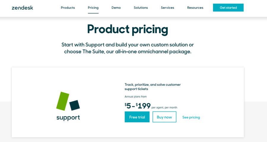
If a user wants more details on the pricing structure, they simply click the See pricing button and are taken to a page with more in-depth information on how the Support product is priced. Smart move.
2. Keep the header copy simple
The goal of the header copy is to say just enough to get the user to convert without getting in their way. Appcues says all they need to in one concise and straightforward sentence.
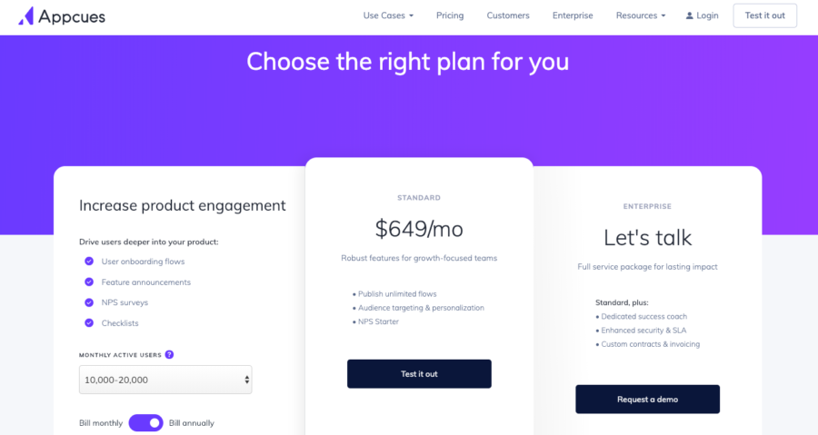
On the left-hand side, they have a simple dropdown to determine your monthly active user count — and they allow you to toggle between monthly and annual billing.
We also love that they provide quick bulleted points about their features, and use the same human copy that aligns perfectly with their branding.
3. Show custom options for each persona you target
You are going to have all kinds of users your pricing landing page, each of who might want to utilize a different aspect of your product. In order to make their lives easier, why not separate out your pricing options for each segment you are targeting? That’s exactly what Hubspot does.
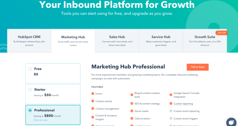
Hubspot segments by each persona up top — Marketing, Sales, Service, and Growth — and then offer different plans within each subsection on the left-hand side of the page.
4. Address frequently asked questions
If a prospect needs a question answered before making a decision, you want them to be able to do so without navigating away from the page. You’ve done so much work to get them here!
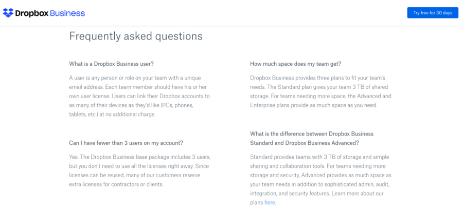
A great way to address this concern from visitors is to list out frequently asked questions somewhere on the pricing page. Dropbox Business lists out nine common questions just below their pricing options.
These questions address common objections and reduce any friction that a visitor might have before signing up.
5. Offer a live chat option
A great complement to a Q&A section is a live chat feature. With live chat, a prospect can instantly talk with a real human if they are on the fence during the decision making process. Salesforce has a chat app that pops up the moment you get on the page. They even show a picture of a real person to reinforce their legitimacy and add a bit of personality to their tech.
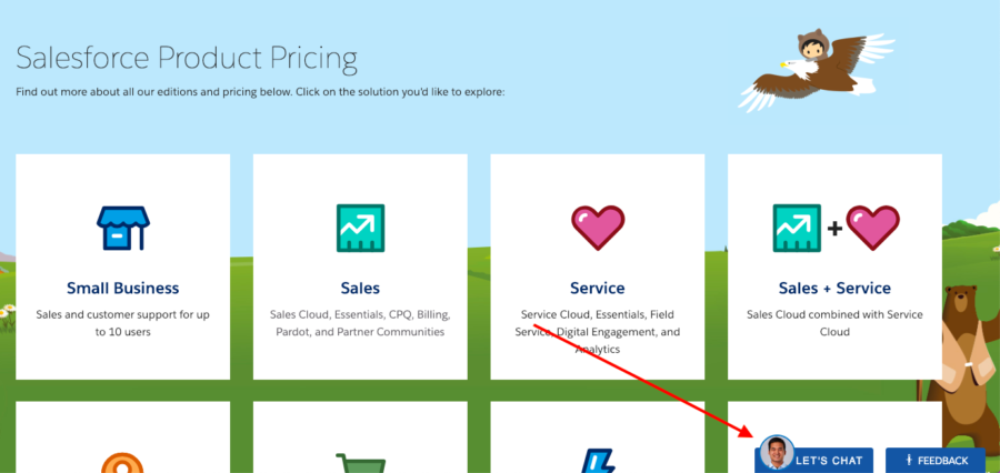
You can accomplish this in many ways — through a custom built solution or now more easily through a tool such as Drift or Intercom.
6. Highlight a free trial
If you run a business where most users enter through a free trial before become paying customers, then it makes sense to direct visitors toward that option. That way, they quickly understand that the page is not just about forcing an immediate purchase.
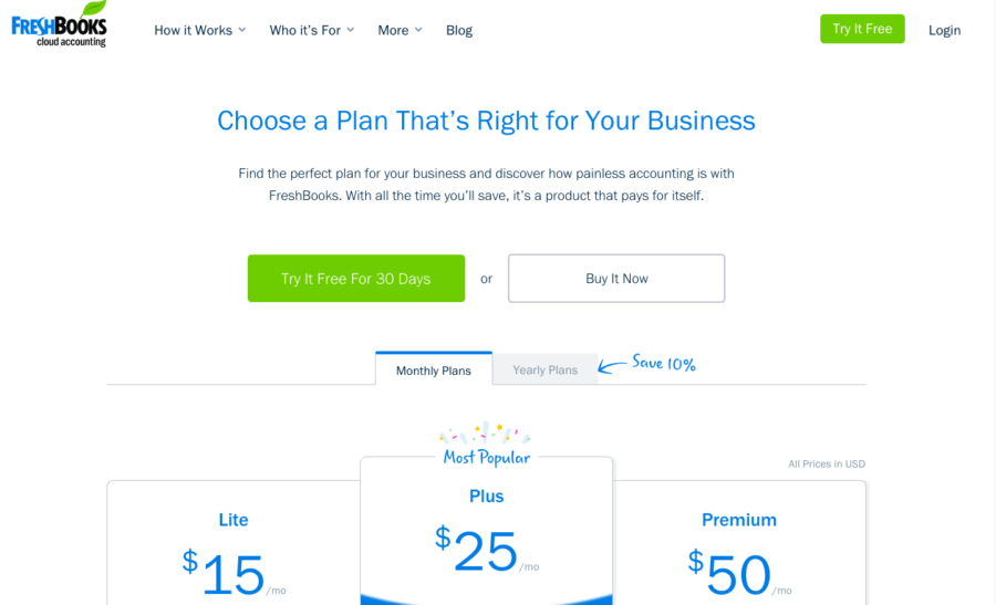
Freshbooks deftly highlights their free trial option in not one, but two places, on their pricing page. They emphasize the savings by coloring the “Try It Free” button in an eye-catching green.
7. Inject personality into the design and copy
There’s no law saying that pricing pages have to be dry. In the ultra-competitive world of SaaS, the best companies stand out by having some fun with the design and copy.
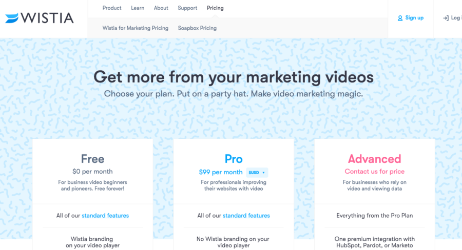
Wistia does this well with their confetti inspired background and playful copy. Who doesn’t want to put on a party hat and install Wistia on their site?
8. Engage the user
Everyone wants to offer just the right package to just the right user. In order to do that, it can be helpful to ask them a question. At Proof, we do that right off the bat.
Our plans are based on visitor count, so asking the question “How many websites does your website get per month?” helps us place visitors into the perfect plan.
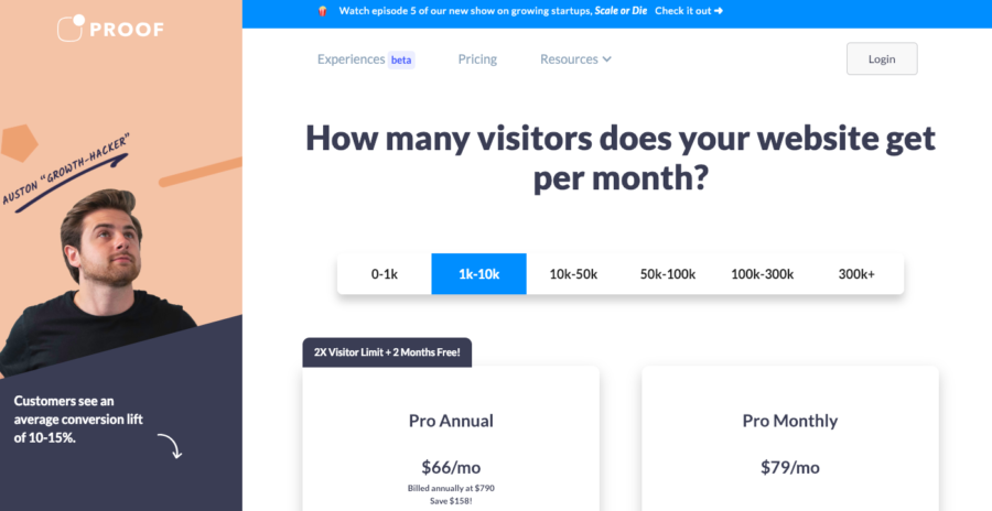
If a user engages, the page dynamically updates in order to show the user them the package that makes the most sense for their business.
9. Use social proof
A glowing testimonial goes a long way toward building trust, and the pricing page is a great place to let potential users see just how much other people love your product. Plus, it saves you from having to write the copy yourself!
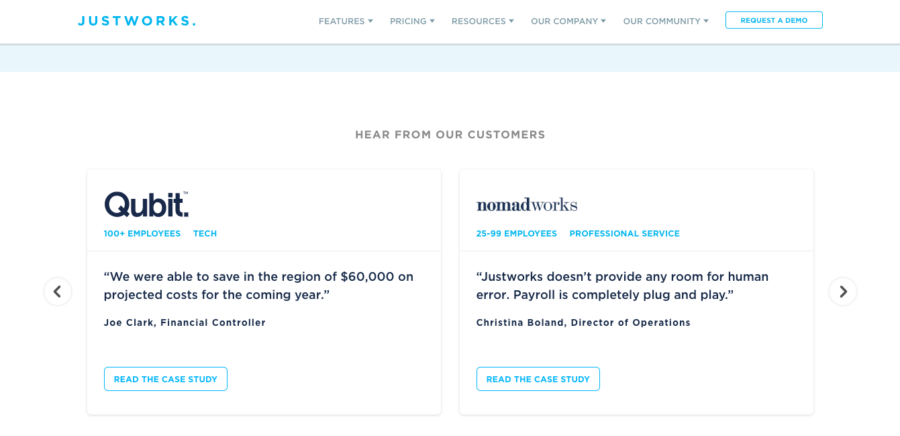
Justworks does a nice job of showcasing testimonials that feel authentic. A nice touch is that they keep it short but still allow the option to read a full case study.
10. Play up the social good of your brand
It’s a big plus to be an eco-conscious and socially conscious brand. If doing good is in your DNA, you want to showcase it whenever possible. This is especially true if you are targeting millennials (spoiler: they love brands that give back).
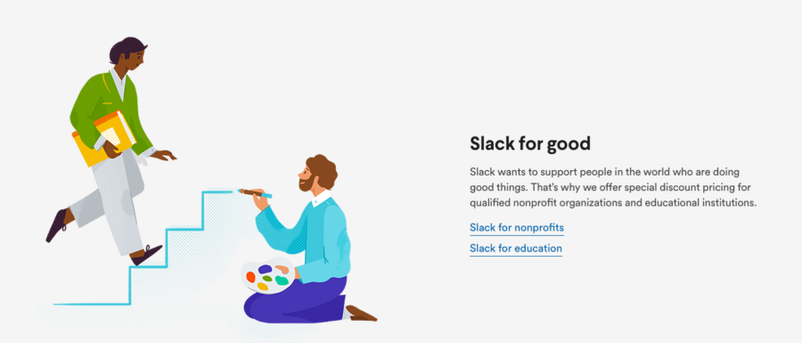
Check out how Slack emphasizes their desire to do good in the world by offering discounts for nonprofits and educational institutions. This ads goodwill and shows that they believe in something other than their bottom line.
11. Emphasize discounts for annual subscriptions
SaaS businesses need revenue yesterday. In a world where the companies that scale fastest gain the spoils, it’s important to get lots of people paying upfront for yearly subscriptions. By highlighting the savings of annual options you can nudge more users toward making that choice from the get-go.
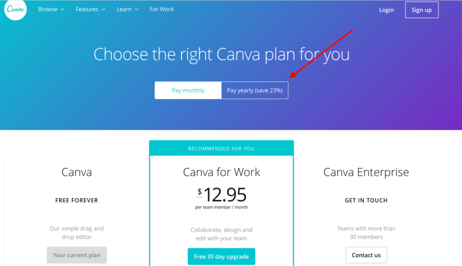
Canva not only highlights that the yearly option is cheaper, but they give you the exact percentage off. Percentages and $$$ speak than just saying “it’s cheaper.”
12. Highlight the most popular option
Think about the original pre-Internet pricing page — the restaurant menu. Restaurants have long been known to organize their dishes so as to encourage the purchase of high margin items. SaaS companies can do the same.
And if your most popular option happens to be more expensive, all the better.
Intercom promotes its more expensive “Pro” plan by showing that 68% of businesses choose it. That is a great way to get someone off the fence and into a plan.
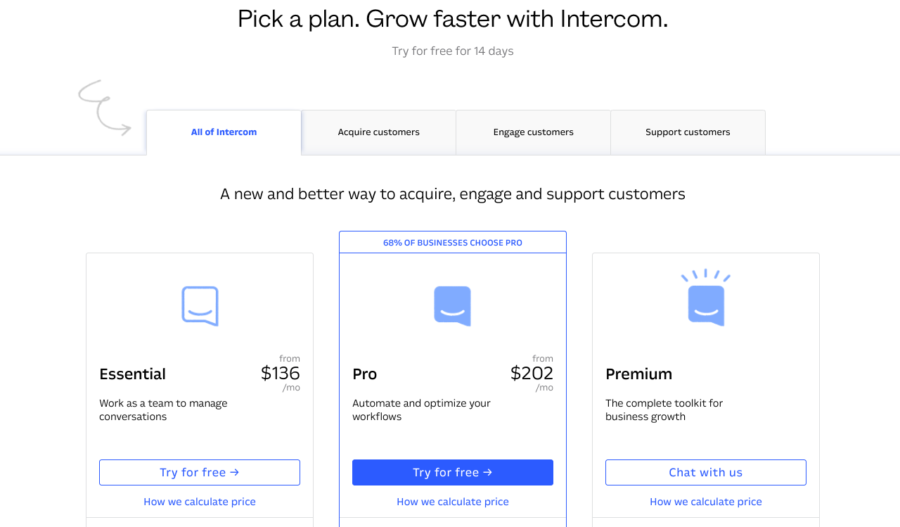
I’m also sure they’ve done some heat mapping and A/B testing on their page to guide you towards the middle option. Notice how the CTA is blue, outlined, and almost preselected for you. It’s hard to want to choose anything else.
13. Address pain points upfront
If you have identified a hiccup that sometimes prevents people from signing up to use your product, the pricing page can be a great place to quickly alleviate that concern.
ActiveCampaign understands that it can be costly and frustrating to migrate contacts from one service to another, so they make it very clear that they will do it for free if you sign up. With the Migration cost built in, the $49/month plan suddenly feels a whole lot more enticing.
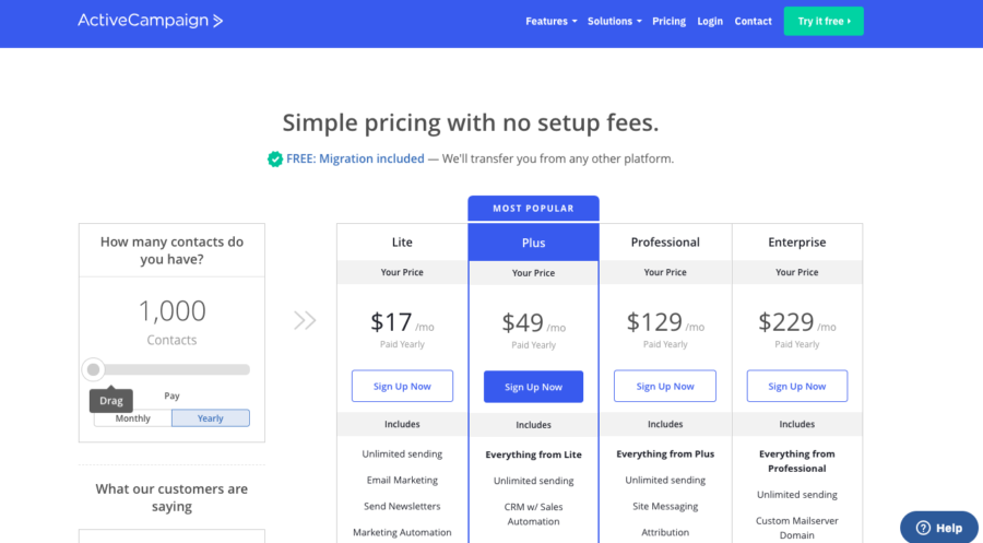
Another interesting feature of their page is the sliding contact scale. Because their plans are priced by contacts — as you slide the scale up, the numbers on the pricing table on the right increase.
14. Go deep on your features
While a pricing page should not feel like a blog post, there is no rule saying you can’t go into granular detail explaining your features. If that’s what it takes to get users engaged, then go for it!
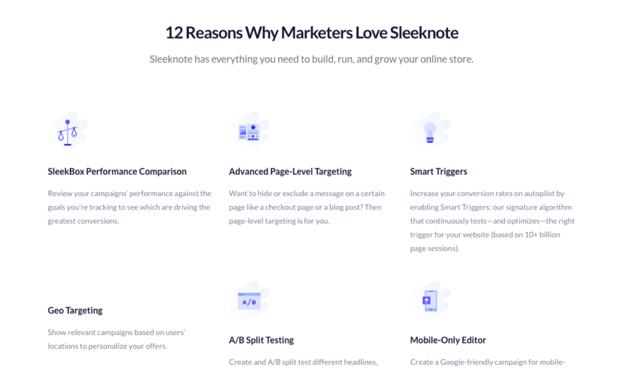
Sleeknote’s “12 Reasons Why Marketers Love Sleeknote” does a nice job of providing concise and digestible content right on the pricing page.
15. Provide a clear breakdown of plan features
Many SaaS businesses offer different tiers of service that each come with different features. When each tier of your service has a lot of different functionalities, it can be tough to lay out the information in an intuitive way.
We love the way Asana handles this problem. They list what comes in the basic packages, but then, instead of repeating everything all the way down the column for their premium packages, they just say “everything in premium plus.”
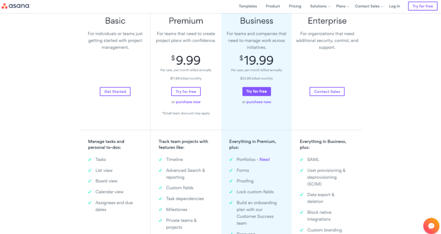
It saves space and the copy gives the package an air of exclusivity. Plus, they have more room to explain the details of what the next tier plan adds for the user rather than what it lacks.
16. Show that you take customer security seriously
One reason people are still skeptical of SaaS companies, especially at the enterprise level, is security. Some folks are understandably wary about putting sensitive information into the cloud.
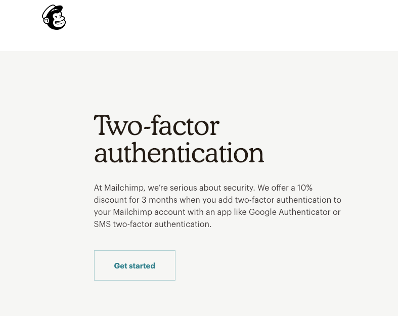
One way to alleviate these concerns is to emphasize how seriously you take security at the moment they are making a purchase decision. For instance, MailChimp offers a discount if you add two-factor authentication to your account. This aligns both buyer and seller on security — and passes along the savings from reduced risk to the buyer.
17. Show prices in different currencies
Successful software companies have customers from all over the world. If you know where your users are coming from (and you should), then you can make them feel more comfortable by showing prices in currencies they might be more familiar with.
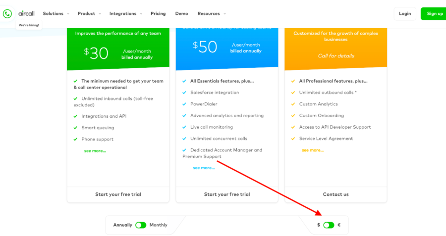
Aircall is based in Europe but clearly does big business in the US, as their pricing page allows users to toggle between seeing prices in Euros and Dollars.
18. Organize plan prices from low to high
81% of leading SaaS companies with pricing pages display their prices in sequential order, from low to high. And it makes sense, from a user experience perspective, consumers don’t like feeling as if they are being tricked.
This is one of those little things that might not matter, but it can’t hurt to follow industry best practices.
19. Promote your free trial with a bold CTA
While it would be ideal for every visitor to your pricing page to buy an annual subscription, that’s not going to happen. Likely, most people will start with a free trial.
So why not promote yours in a fun and bold way? Shopify’s inventive and provocative CTA button does the trick.
20. Charge high and be confident
Don’t shy away from high prices. To many users, they can signal quality.
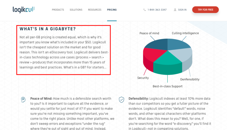
An alternative method is to use your copy to bolster your position. Logickull expertly does this, leaning into their premium price, which makes them come across as self-assured in their quest to target just the right user: “Logickull isn’t the cheapest solution on the market and for good reason.”
21. Showcase both scale and chic
The use of quality logos and a nod to your scale make great additions to testimonials and social proof. It allows you to intrigue tech insiders as well as those who want proof that you are widely trusted.
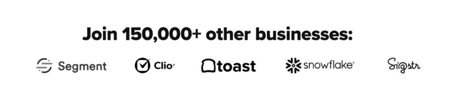
Drift does a wonderful job of this on their site. They display a few logos of trendy tech companies while also making sure the visitor knows that they work with a ton of businesses.
How to design a pricing page that converts
Hopefully, this gives you a good base to go off as you build your pricing page. Keep in mind that there is one thing more important than any aspect on this list — you have to test, test, test!
Every growing business is unique so you won’t know exactly what works until you start trying stuff and running conversion optimization experiments.
If you track, iterate, and optimize, you’ll have a great chance of creating a high converting pricing page.


